Submitted over 3 years ago
3-column-preview-card-component-main-mobile-and-dekstop

@jgrospe92

Design comparison
SolutionDesign

Solution retrospective
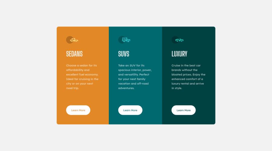
I am missing something, especially on the mobile screen. It is not accurate as of the one in the design image. I would love to see other solutions for this challenge.
Community feedback
- @ChamuMutezvaPosted over 3 years ago
- between 600px and 900px the cards are not equal in terms of height, use dev tools to see . Try using another value of align-items instead of center, maybe
align-items: stretch - you can see other solutions by selecting
Visit challenge hubon this page and then selectingsolutions
Marked as helpful0 - between 600px and 900px the cards are not equal in terms of height, use dev tools to see . Try using another value of align-items instead of center, maybe

Please log in to post a comment
Log in with GitHubJoin our Discord community
Join thousands of Frontend Mentor community members taking the challenges, sharing resources, helping each other, and chatting about all things front-end!
Join our Discord