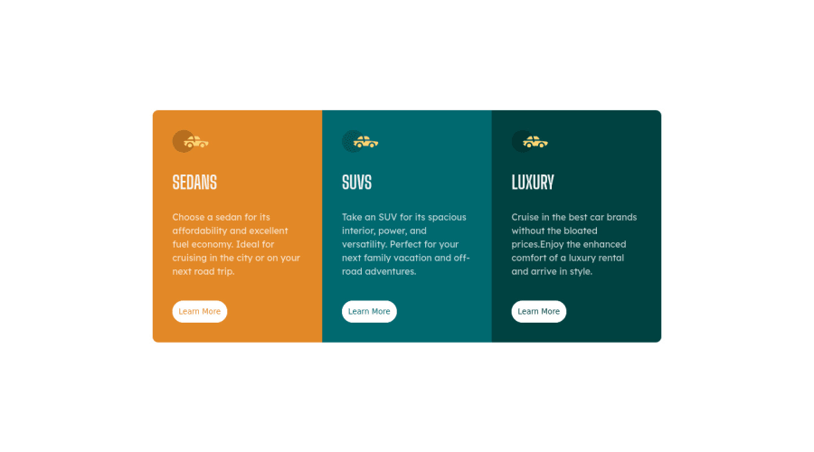
3-column-preview-card-component-main
Design comparison
Solution retrospective
i hope that my coding is good, but if you found duplicate in code or errors tell me to improve my skills.
Please log in to post a comment
Log in with GitHubCommunity feedback
- @imadvv
Greeting Ahmed! Congratulations for completing your challenge, 👏👏👏.
I take a moment to look at your code, and you did great job, moreover I have some tips for you that may help improve your solution,
for the body is a good idea to change the fix
height: 100vhtomin-height: 100vhlet the body grow with the contents, if you look at devtools on the browser and hove over body element you will notice that body not wrapping up all the page, you can check this also by changingbackground-colorin the body, as for the cards if each of them well have ah1it's better to change from thedivtosectionelement for more semantically meaning, and you can take advantage for that to reduce duplication on css and use nth-child pseudo-class.example<section class="card"> </section> <section class="card"> </section> <section class="card"> </section>css.cards { display: inline-block; padding: 35px; width: 300px; } .cards::nth-child(1) { background-color: hsl(184deg, 100%, 22%); } .cards::nth-child(2) { background-color: hsl(184deg, 100%, 22%); } .cards::nth-child(3) { background-color: hsl(184deg, 100%, 22%); }and to solve border-radius issue you can simply put it on the container itself,
.container {
border-radius : 10px;
}
Hope this give you some hints Overall you did great, have a great day/night, and keep coding 👍.
Marked as helpful
Join our Discord community
Join thousands of Frontend Mentor community members taking the challenges, sharing resources, helping each other, and chatting about all things front-end!
Join our Discord
