3-column-preview-card-component-main using HTML and CSS
Design comparison
Community feedback
- @VCaramesPosted about 2 years ago
Hey there!👋 Here are some suggestions to help improve your code:
-
The purpose of the Main Element is to identify the main content of your page. It is not the container of you component. After the main element, you want add a container to wrap you separate components in.
-
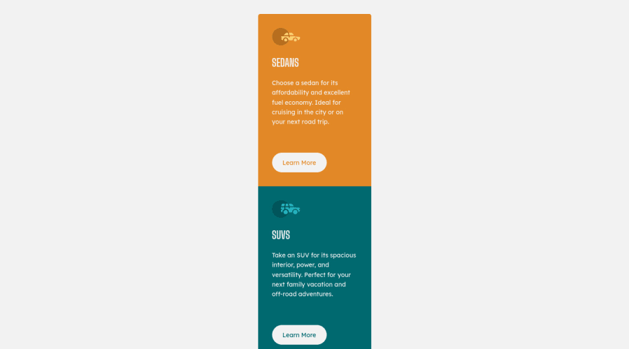
The car images/icons in this component are purely decorative; They add no value. So their Alt Tag should left blank and have an aria-hidden=“true” to hides them from assistive technology.
-
The headings in your component are being used incorrectly. Since the <h1> Heading can only be used once, it is always given to the heading with the highest level of importance. This component has three headings of equal importance, so the best option would be to use an <h2> Heading, since it is reusable and it will give each heading the same level of importance.
If you have any questions or need further clarification, let me know.
Happy Coding! 👻🎃
Marked as helpful0@MaryamhusseinPosted about 2 years agoThank u for feedback ,but for the alt attribute and h1 I did that to achieve the challenge requirement
0@VCaramesPosted about 2 years ago@Maryamhussein
The analyzer cannot differentiate a "full site" from a "component".
While, the analyzer may not give off an error, you still used the headings incorrectly. Like I mentioned, the h1 Heading is only allowed to be used once for page.
https://www.w3schools.com/tags/tag_hn.asp
https://developer.mozilla.org/en-US/docs/Web/HTML/Element/Heading_Elements
0 -
- @AdrianoEscarabotePosted about 2 years ago
Hi Maryam Ali, how are you?
I really liked the result of your project, but I have some tips that I think you will enjoy:
- Consider using rem for font size .If your web content font sizes are set in absolute units, such as pixels, the user will not be able to re-size the text or control the font size based on their needs. Relative units “stretch” according to the screen size and/or user’s preferred font size, and work on a large range of devices.
if you want to continue coding with px, you can download a very useful extension in vscode, it converts px to rem! link -> px to rem
The rest is great!
I hope it helps... 👍
Marked as helpful0
Please log in to post a comment
Log in with GitHubJoin our Discord community
Join thousands of Frontend Mentor community members taking the challenges, sharing resources, helping each other, and chatting about all things front-end!
Join our Discord
