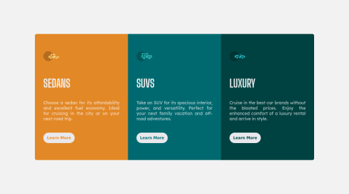
3-column-preview-card-component-main using Flexbox and Grid
Design comparison
Solution retrospective
Hi everyone!
Although the design project is relatively simple, I currently struggle with responsiveness. I use relative measures, flexbox and grid, but I can't see where I'm going wrong.
Feedback welcome!
Community feedback
- @imadvvPosted over 2 years ago
Greetings Douglas Mardegan Colodete!! Congratulations on completing This challenge!, 👏👏👏
You did great job and your solution almost done, here are a small changes to make and it will be responsive.
body { min-height: 100vh; padding-block: 2rem; }
@media only screen and (min-width: 23.438rem) { main { / * height: 100vh; * this fix height is the problem just remove it you don't need any height here/ } }
and replace this media query
@media only screen and (min-width: 90rem)
with this@media only screen and (min-width: 50rem)
and it should be fixed,
Over All you did Great, Happy coding and Have a Good Day/Night 👍
Marked as helpful0@douglasmardeganPosted over 2 years ago@imadbg01 Thank you so much for the feedback and for sharing some of your experience.
Regarding your solution to the same challenge, I really liked the animations, but especially the background with the Lamborghini image.
1@imadvvPosted over 2 years ago@douglasmardegan You're Welcome My friend, am really happy to help.
0
Please log in to post a comment
Log in with GitHubJoin our Discord community
Join thousands of Frontend Mentor community members taking the challenges, sharing resources, helping each other, and chatting about all things front-end!
Join our Discord