3-column-preview-card-component-main
Design comparison
Community feedback
- @VCaramesPosted about 2 years ago
Hey @olaniyivictor, some suggestions to improve you code:
-
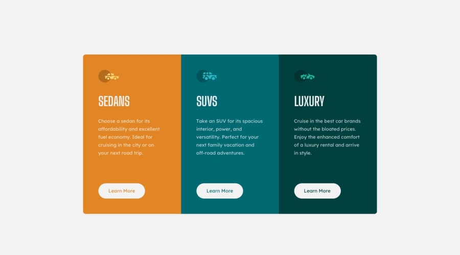
The car images/icons serve no other purpose than to be decorative; They add no value. Their Alt Tag should left blank and have an aria-hidden=“true” to hides it from assistive technology.
-
The headings are being use incorrectly. For this challenge, each heading is equally as important. So best option, is to use <h2> Heading, because it will give each card the same level of importance and it's reusable.
-
Your "buttons" were created with the incorrect element. When the user clicks on the button they should directed to a different part of you site. The Anchor Tag will achieve this.
-
A white border should appear when users hover on your button.
-
Your content is not fully responsive. Here is a link to Google Developer’s site that will teach you how make it 100% responsive:
Happy Coding! 👻🎃
0 -
Please log in to post a comment
Log in with GitHubJoin our Discord community
Join thousands of Frontend Mentor community members taking the challenges, sharing resources, helping each other, and chatting about all things front-end!
Join our Discord
