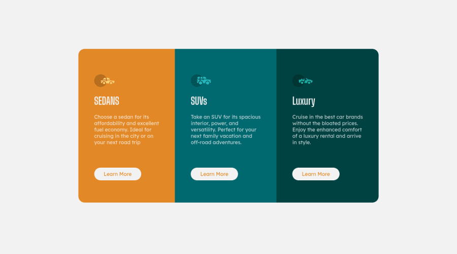


Design comparison

Solution retrospective
I can't put it as responsive, the backgrounds are crooked with less than 400px. help is welcome! :)
Community feedback
- @VCaramesPosted over 2 years ago
Hey there!👋 Here are some suggestions to help improve your code:
-
Reduce 📉 the
border-radiusto better match the FEM example. -
The car images/icons in this component are purely decorative; They add no value. So their Alt Tag should left blank and have an aria-hidden=“true” to hides them from assistive technology.
-
The headings in your component are being used incorrectly. Since the <h1> Heading can only be used once, it is always given to the heading with the highest level of importance. This component has three headings of equal importance, so the best option would be to use an <h2> Heading, since it is reusable and it will give each heading the same level of importance.
-
Your content is not fully responsive. Here is a link to Google Developer’s site that will teach you how make it 100% responsive:
If you have any questions or need further clarification, let me know.
Happy Coding! 👻🎃
0 -
- @correlucasPosted over 2 years ago
👾Hello Yago, Congratulations on completing this challenge!
Great code and great solution! I’ve few suggestions for you that you can consider adding to your code:
- Add the correct color for the background, that in this case is
background-color: #F2F2F2 - The html structure entirely with
div blocksbut these div doesn't any semantic meaning, for this reason is better you use a better html markup improving your code, for example for each vehicle card you use<article>instead of the<div>. - The icon doesn’t have an important role when you think about semantics and the html structure. So you can add
aria-hidden=“true”to avoid it being found and read in the accessibility mode/screen readers. These are only decorative items. - Use
max-width: 100%for the cards in the mobile version to allow the cards grow 100% of the width considering the paddings and avoid to have a lateral gap (limited by a fixed width). - To make your CSS code easier to work you can create a
single classto manage the content that is mostly the same for the 3 cards (paddings, colors, margins and etc) and another class to manage the characteristics that are different (colors and icon), this way you'll have more control over then and if you need to change something you modify only one class. - Think about using relative units as
remoreminstead ofpxto improve your performance by resizing fonts between different screens and devices. Anyhow, if we want a more accessible website, then we should use rem instead of px. REM does not just apply to font size, but to all sizes as well.
✌️ I hope this helps you and happy coding!
0 - Add the correct color for the background, that in this case is
- @RoneeeyPosted over 2 years ago
You need to wrap your 3 divs for the cards in a div. See below:
<DIV CLASS="CONTAINER"> <--------- THIS IS THE WRAPPER FOR THE 3 DIVS BELOW. MAKE SURE TO CLOSE IT OFF AFTER YOUR 3RD DIV ( <div class="terceiracoluna">)SET THE ABOVE CONTAINER TO DISPLAY FLEX AND JUSTIFY CONTENT AND ALIGN ITEMS CENTER. AFTER THAT YOU NEED TO ADD IN THE MEDIA QUERY AND SET THE CONTAINER/WRAPPER TO DISPLAY BLOCK OR FLEX-WRAP: WRAP AND CHANGE THE STYLES OF THE ELEMENTS ACCORDINGLY.
CHECK OUT THE LINK BELOW FOR A FLEXBOX TUTORIAL THAT EXPLAINS IT REALLY WELL. ALSO READ UP ON MEDIA QUERIES ON W3SCHOOLS.COM.
https://www.youtube.com/watch?v=3YW65K6LcIA&ab_channel=TraversyMedia
CREATE BUTTONS USING THE BUTTON ELEMENT - <button> - YOU WILL NEED TO STYLE IT IN YOUR CSS.
<div class="primeiracoluna"> <img src="images/icon-sedans.svg" alt="logosedan"> <h1>SEDANS</h1> <p class="paragrafo"> Choose a sedan for its <br> affordability and excellent <br> fuel economy. Ideal for <br> cruising in the city or on <br> your next road trip </p> <a href="#">Learn More</a></div> <div class="segundacoluna"> <img src="images/icon-suvs.svg" alt=""> <h1>SUVs</h1> <p class="paragrafo"> Take an SUV for its spacious <br> interior, power, and <br> versatility. Perfect for your <br> next family vacation and <br> off-road adventures.</p> <a href="#">Learn More</a> </div> <div class="terceiracoluna"> <img src="images/icon-luxury.svg" alt=""> <h1>Luxury</h1> <p class="paragrafo"> Cruise in the best car brands <br> without the bloated prices. <br> Enjoy the enhanced comfort <br> of a luxury rental and arrive <br> in style.</p> <a href="#">Learn More</a> </div> <div class="learnmore"> </div>0


Please log in to post a comment
Log in with GitHub
Join our Discord community
Join thousands of Frontend Mentor community members taking the challenges, sharing resources, helping each other, and chatting about all things front-end!
Join our Discord