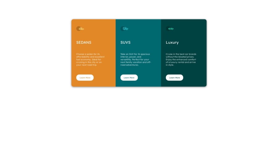


Design comparison

Community feedback
- @0xabdulkhaliqPosted over 1 year ago
Hello there 👋. Congratulations on successfully completing the challenge! 🎉
- I have other recommendations regarding your code that I believe will be of great interest to you.
POINTING CURSOR ↗️:
- Looks like the component's
buttonelement has not a pointer, this property plays a major-role in terms of both UI & UX
- The
cursor: pointerCSS property is important for button-like elements because it changes the cursor from the default arrow to a pointer when hovering over the element. This provides a visual cue to the user that the element is clickable and encourages interaction.
- In terms of UI/UX, using
cursor: pointerhelps to improve the usability of the interface by making it easier for users to identify interactive elements. It also helps to provide feedback to the user by indicating which elements are clickable and which are not.
- So we want to add this property to the following
buttonelements
button { cursor: pointer; }- Now your component's
buttonhas got the pointer & you learned about this property as well
.
I hope you find this helpful 😄 Above all, the solution you submitted is great !
Happy coding!
Marked as helpful0 - @rohitd99Posted over 1 year ago
Hi @mRkOoL
Congrats on completing the challenge 🎉.
I have a few suggestions which might help you. You can use the following properties on your body to keep the container centered:
min-height: 100vh;
display : flex;
justify-content: center;
align-items: center;
The min-height: 100vh makes sure the height is atleast 100vh and can expand further if the content allows. Also remove the margins on the container for it to be exactly centered. In your media query for the container you can have the following properties as on tablet sizes I noticed the content was overflowing the screen.
media screen and (min-width: 500px)
.Container {
flex-direction: row;
max-width: 700px;
width: 100%;
/* min-width: 600px; */
height: 350px;
/* margin-top: 100px; */
}
You also don't have an
h1, generally each page must have a singleh1for the title of the page. Although I agree there isn't any text to signify a title you can create a title which is only visible for screen readers. You can have a classsr-onlywhich hides the text visually but not from screen readers and also keeps theh1in the page for SEO reasons..sr-only { border: 0; clip: rect(0 0 0 0); height: 1px; margin: -1px; overflow: hidden; padding: 0; position: absolute; width: 1px; }Hope it helps.
Marked as helpful0 - @OmprakashRPosted over 1 year ago
Hi, Congratulations!!
Some feedback for your code structure
- use alt=" " ( not to be empty) text for images ( if the image does not render properly that time needs to show some alt text.)
*** Example ***
<span><img src="./images/icon-sedans.svg" alt="icon-sedans"></span>
.- Don't use inline style
button style="color: hsl(184, 100%, 22%);">Learn More</button> add class instead of thisI hope this is helpful to you.
Thank You!!!
Marked as helpful0 - use alt=" " ( not to be empty) text for images ( if the image does not render properly that time needs to show some alt text.)
*** Example ***


Please log in to post a comment
Log in with GitHub
Join our Discord community
Join thousands of Frontend Mentor community members taking the challenges, sharing resources, helping each other, and chatting about all things front-end!
Join our Discord