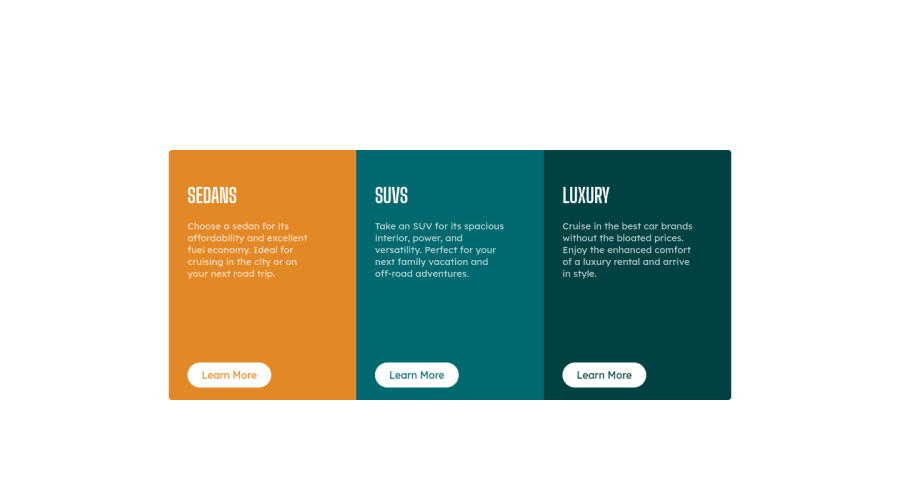
Design comparison
Community feedback
- @correlucasPosted about 2 years ago
👾Hi @i-blu, congrats on completing this challenge!
Your solution its almost done and I’ve some tips to help you to improve it:
1.When you download the project files there’s a file called
style-guide.mdwhere you can find information such ashsl color codesand thefont-sizefor the headings. The background-color in this case isbackground-color: #F2F2F22.Use
<main>instead of<div>to wrap the card container, its better to use<mai>in this case because you’re indicating that’s the main block of content of this page and also because<div>doesn’t have any meaning, it's just a block element.3.Every page needs a main heading, the
<h1>to show which is the most important heading. You need to increase the headings by one level, like h1, h2, h3 to show the titles hierarchy. Remember that you cannot have more than one h1 heading.4.You made your html structure entirely with
div blocksbut these div doesn't any semantic meaning, for this reason is better you use a better html markup improving your code, for example for each vehicle card you use<article>instead of the<div>.This article from Freecodecamp explains the main HTML semantic TAGS: https://www.freecodecamp.org/news/semantic-html5-elements/
✌️ I hope this helps you and happy coding!
0
Please log in to post a comment
Log in with GitHubJoin our Discord community
Join thousands of Frontend Mentor community members taking the challenges, sharing resources, helping each other, and chatting about all things front-end!
Join our Discord
