Design comparison
Solution retrospective
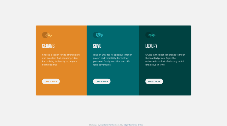
I had to use { height: 84vh } (It's this ok?) to center my container. Flex box didn't work to me because I don't find a way to manage the height of the element. How can I get this? Thanks.
Community feedback
- @edgarfbPosted over 3 years ago
Thanks a lot, Eric.
0@ericsalviPosted over 3 years ago@edgarfb If you end up playing around with those suggestions to help with the container height and such, please let me know. Curious if you find it much easier for fluidity and responsiveness.
0@edgarfbPosted over 3 years agoHi Eric! I had try your suggestions and you are right it is much easier this way. I have applied de min-height to the paragraphs too. You can see the changes here: https://distracted-hugle-e46e15.netlify.app
0 - @ericsalviPosted over 3 years ago
What you could is first set a max-width and a min-height on the card container. Remove the 70% width on this while you are at it.
After that, take a look at the container class and set the height from 84vh to 100vh. You'll also need to remove the top and bottom padding on the body on the desktop version of the layout.
0
Please log in to post a comment
Log in with GitHubJoin our Discord community
Join thousands of Frontend Mentor community members taking the challenges, sharing resources, helping each other, and chatting about all things front-end!
Join our Discord