Design comparison
Solution retrospective
Can anything from the code be optimised?
Community feedback
- @StefanoDeCapitaniPosted over 3 years ago
Hey @midnith, welcome in the community! Great work :)
I suggest you to try using
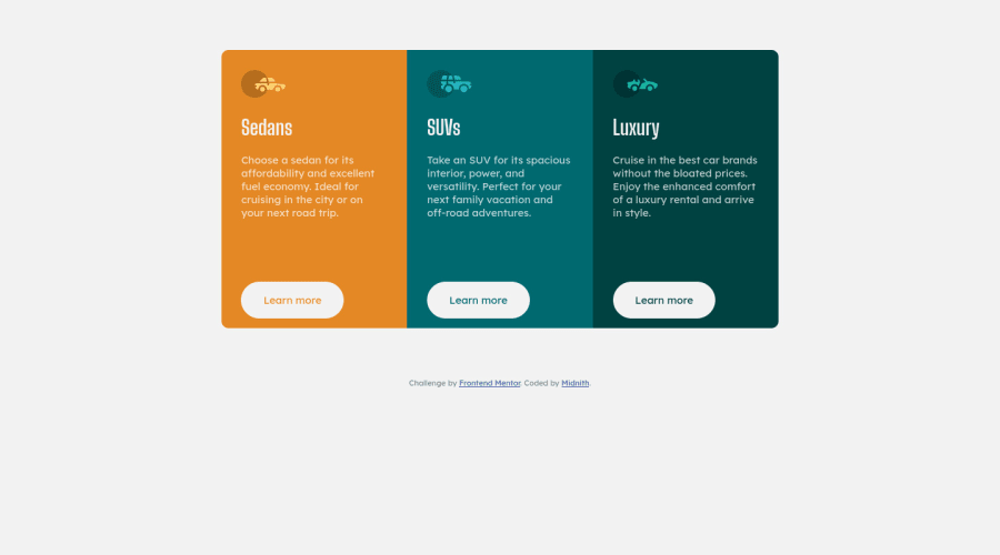
display: flex-boxon the container instead ofinline-blockon the cards, it will make it so much easier to position the items where you want inside a container and to avoid at the start many responsiveness issues you could run into.In case you don't know where to start, here you can find some interesting stuff:
- An overview to get some context - Youtube - Kevin Powell
- [A complete guide to Flex-box - CSS-Tricks] (https://css-tricks.com/snippets/css/a-guide-to-flexbox/)
I hope these resources are as useful to you as they have been to me!
Happy coding ;)
Marked as helpful1@MidnithPosted over 3 years ago@StefanoDeCapitani Hi! Thanks a lot for your feedback. It was really helpful :) I have implemented the flexbox and removed the inline-block. I didn't know about this attribute and it comes very handily, along with the grid one to structure the page more efficiently.
0 - P@palgrammingPosted over 3 years ago
you need to remove the
heightfrom your.carsyou also need to transition you
border-radiussetting to different corners of the layout depending if it is in the desktop or mobile view0@MidnithPosted over 3 years ago@palgramming Hi! Thanks for your feedback :) I have removed the height section from .cars, but I don't know what do you mean about the transition of the border-radius. I have a different border-radius for desktop and mobile views already.
0
Please log in to post a comment
Log in with GitHubJoin our Discord community
Join thousands of Frontend Mentor community members taking the challenges, sharing resources, helping each other, and chatting about all things front-end!
Join our Discord
