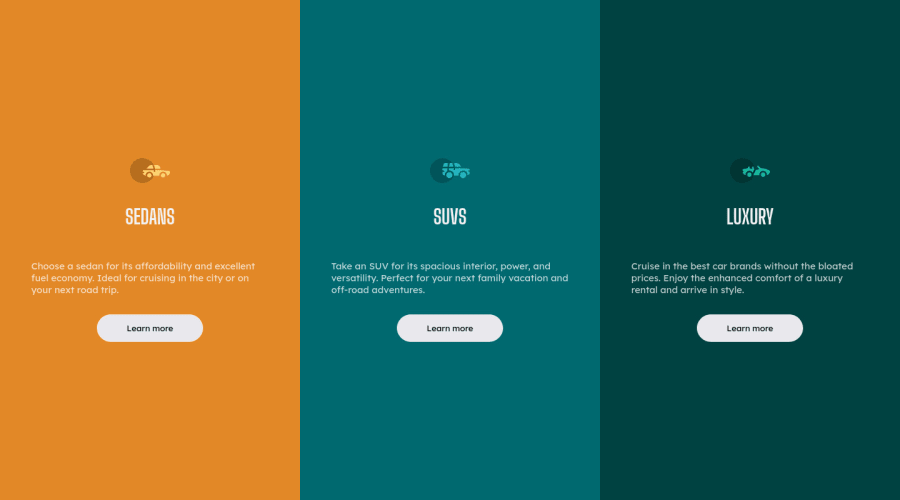
Design comparison
SolutionDesign
Community feedback
- @lukejansPosted almost 2 years ago
Hey, Thales! You got the design down on this one but i have some recommendations for you if you're interested in getting as close to design as possible. There are a couple tips i have for you but the 2 big ones would be responsiveness and following identical design layout.
- Your cards take up all the screen space which is less than ideal. here are some tips to change that. first you can add a wrapper to you page so you can center the component you built to do this you can add a container and or wrapper around all of your code the first level after the body then nest your code inside it and apply this css rule.
.wrapper {
  display: flex;
  justify-content: center;
  flex-direction: column;
  align-items: center;
  min-height: 100vh;
}
than you can set a width on your left center and right card classes or define it in the above class.
- to make your webpage responsive on small screens you will need to use
@mediaqueries. this post will get a little lengthy so ill just link my repo for this challenge so you can figure out how to integrate it into your code. 3-coulmn-component.
Marked as helpful0@thalesbsbPosted almost 2 years ago@lukejans muito obrigado pela ajuda... De fato estava quebrando a cabeça para achar solução para esse problema.
1
Please log in to post a comment
Log in with GitHubJoin our Discord community
Join thousands of Frontend Mentor community members taking the challenges, sharing resources, helping each other, and chatting about all things front-end!
Join our Discord
