Design comparison
Solution retrospective
I finished another challenge. Any feedback would be appreciate! Thanks in advance, have a nice day! :)
Community feedback
- @anar-solPosted about 3 years ago
Hi =)
As shown in the accessibility and structure reports, you are using the same
id='column'three times. Anidattribute is supposed to identify a unique element in the page. I don't think you needidfor styling.You set the container height to
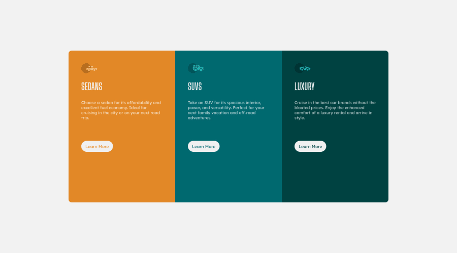
60vh, 60% of the viewport height and it becomes too high compared to the original design. Don't set a fixed height on the container, let the height be automatically calculated from the contained elements.If you want a certain amount of space between the elements in each column, try to use some margins / paddings or any other method to lay them out locally.
You are also, setting each column width to
42vh, I don't think it's the best way to do.Why not just use a flex container, make it vertical on mobile (and perhaps tablet) and when there's enough space, make it horizontal with the same space for each column?
1
Please log in to post a comment
Log in with GitHubJoin our Discord community
Join thousands of Frontend Mentor community members taking the challenges, sharing resources, helping each other, and chatting about all things front-end!
Join our Discord
