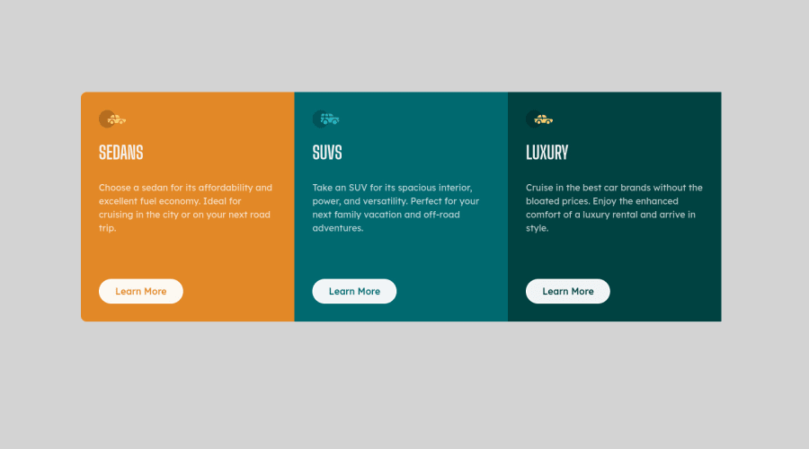
Design comparison
Solution retrospective
If you have any questions or suggestions ask freely.
Community feedback
- @darryncodesPosted over 3 years ago
Hi Mariusz,
Great design, very responsive too - well done!
- you could add
max-width: 320px;.columnso your card doesn't stretch across the whole of the viewport at the mobile break point - you could add
align-self: flex-start;to your<button>to stop the button from stretching all the way across the card - it's best practice to not use id's for styling
- if you add an alt-text to your images and change
<div class="mainContainer">to<main class="mainContainer">you'll clear your accessiblity report
Good luck with it all!
1@molszewski34Posted over 3 years ago@darryncodes yes, that is great idea to add max-width to it. Thanks for advice. Why it is not good idea to use id's for styling?
0@darryncodesPosted over 3 years agoyou're welcome @molszewski34 glad it has helped! This article does a really good job of explaining some reasons why
1@molszewski34Posted over 3 years ago@darryncodes thank you. Next week i plan to upload few more solutions. I would realy appreciete if you would just look at them and share your thoughs.
0@darryncodesPosted over 3 years agoof course @molszewski34, I’ll do what I can to help!
0 - you could add
Please log in to post a comment
Log in with GitHubJoin our Discord community
Join thousands of Frontend Mentor community members taking the challenges, sharing resources, helping each other, and chatting about all things front-end!
Join our Discord
