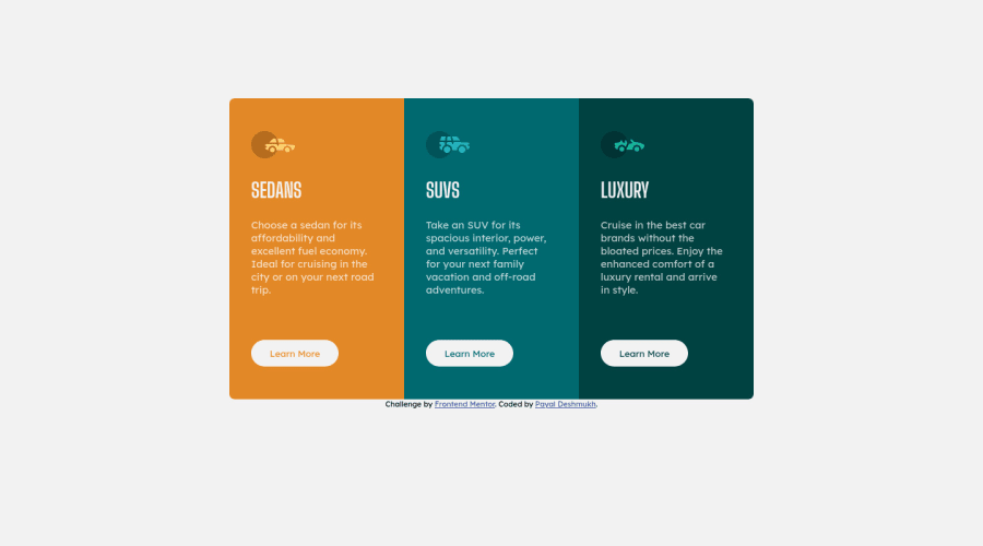
Design comparison
Solution retrospective
While designing a solution for a 3-column-preview-card I faced two difficulties:
- using 'margin: auto; ' didn't bring the container of cards to the center
- display:flex; justify-content: center; align-items: center; This brought the container to the center horizontally, but vertically it was still stuck to the top of the screen. So had to use 'margin-top:9rem; ' to bring it to the center. Why both the cases didn't work properly? Is there any other solution to bring the container to the center? When hovered on Learn More button size of the respective card is slightly increasing. All feedbacks and comments are welcome.
Please log in to post a comment
Log in with GitHubCommunity feedback
- @cosmoart
Hi Payal! Looks great!... Both cases didn't work because the body didn't have enough height to center its elements. If you want to center a card like the one in this challenge, I recommend you use this method:
.center {
    position: absolute;
    top: 50%;
    left: 50%;
    transform: translate(-50%, -50%);
}
Regarding the change in size of the cards when hovering on the button, it is because you are using border: which increases the size of the button, forcing the other boxes to do so as well. To fix it you can use outline or use an invisible border:
button{
    border: 2px solid transparent;
}
button:hover{
    border: 2px solid red;
}
As a last recommendation, I suggest you use a more semantic html: you can use
<main>,<section>,<figure>etc.I hope this is useful for you... Keep it up👍
Marked as helpful
Join our Discord community
Join thousands of Frontend Mentor community members taking the challenges, sharing resources, helping each other, and chatting about all things front-end!
Join our Discord
