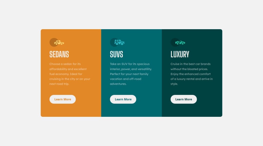
Design comparison
Solution retrospective
Hello everyone! I recently completed a frontend project using HTML and CSS, and I would greatly appreciate your valuable feedback. I'm particularly interested in learning about any mistakes or areas for improvement that you might have noticed. Your guidance and suggestions on how to enhance the project would be immensely helpful to me. Thank you in advance for taking the time to review and provide your insights!
Community feedback
- @danielmrz-devPosted 10 months ago
Hello @Neel-07!
You did a very good job there!
I have a very simple suggestion for improvement:
- Since the button is a clickable element, it's nice to add
cursor: pointer
to it.
š This gives the user a visual indication that the element is clickable, as obvious as it may look.
I hope it helps!
Other than that, you did a great job!
0@Neel-07Posted 9 months ago@danielmrz-dev yes, i was about to add a cursor pointer but i guess i overlooked it. Thank You for bringing it to my notice.
0 - Since the button is a clickable element, it's nice to add
- @Alokray007Posted 10 months ago
Hello there! šš½āāļø
Your solution looks excellent!
I have a suggestion about your code that might interest you:
š If you don't have the Figma design files, I recommend using a browser extension called Perfect Pixel.
It allows you to compare your finished project with the design images that come along when you download the project and check the (almost exact) dimensions. It's very useful!
I hope it helps you in future projects! š
Other than that, great job!
0@Neel-07Posted 10 months ago@Alokray007 thank you for letting me know about this extension.
0
Please log in to post a comment
Log in with GitHubJoin our Discord community
Join thousands of Frontend Mentor community members taking the challenges, sharing resources, helping each other, and chatting about all things front-end!
Join our Discord