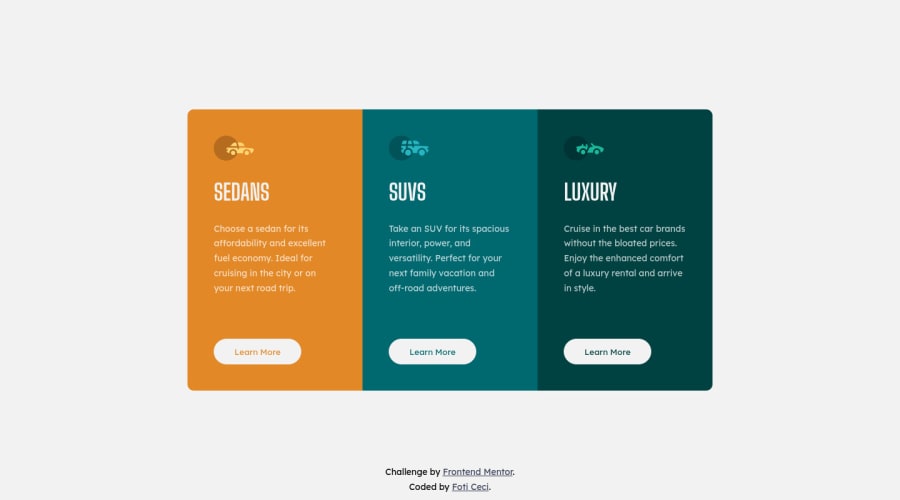
Design comparison
Solution retrospective
Would love to hear some feedback or suggestions on improving my code quality!
Community feedback
- @Jos02378Posted over 3 years ago
Hey Foti, Great job on making this solution!
I open your solution on IPad and it seems that the outer edges of the cards are not rounded because the layout of your solution is 2 cards stacked on top of a card, you can try to fix it for the IPad resolution to improve your solution. Also, you can try to make the height of the cards a little taller for the desktop size to make it similar to the design.
I hope this helps, Good luck!
Marked as helpful0
Please log in to post a comment
Log in with GitHubJoin our Discord community
Join thousands of Frontend Mentor community members taking the challenges, sharing resources, helping each other, and chatting about all things front-end!
Join our Discord
