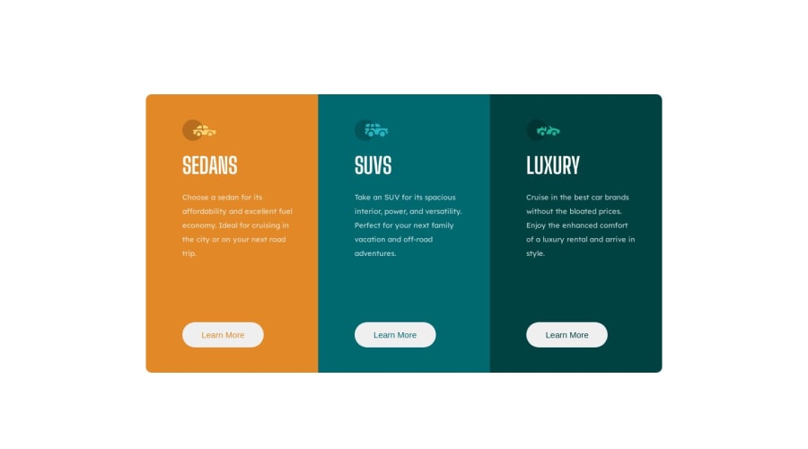
3-column-preview-card-component using flex box html and css
Design comparison
Solution retrospective
All feedbacks are welcome.
Community feedback
- @MelvinAguilarPosted over 1 year ago
Hello there 👋. Good job on completing the challenge !
I have some suggestions about your code that might interest you.
HTML 🏷️:
- Wrap the page's whole main content in the
<main>tag.
- Use only one
<h1>tag per page. The <h1> tag is the most important heading tag, so using multiple <h1> tags can be confusing for screen readers and search engines. Instead, you can use <h2> tags for subheadings like "Sedans", "SUVs", and "Luxury". You can read more about this here 📘.
- Use the <a> tag instead of the <button> tag. The "Learn More" element on your page is a link to another page, so it should use the <a> tag. You can use <button> tags for actions such as submitting a form or closing a modal. You can read more about this here 📘.
-
Use flexbox or grid layout to center your elements instead of using margins. The advantage of using these CSS properties is that they allow you to center elements both horizontally and vertically and are better suited for responsive design.
body {
    min-height: 100vh;
    display: grid;
    place-content: center;
}

.container {
    /* margin: 21vh auto; */
}
I hope you find it useful! 😄
Happy coding!
4@abelkm99Posted over 1 year agowhat's the advantage of wrapping the whole main content in to the main tag since i only have 1 container @MelvinAguilar
0@0xabdulkhaliqPosted over 1 year ago@abelkm99, i'll explain it in detail.
SEMANTICS 🏷️:
- This solution may cause accessibility errors due to lack of semantic markup, which causes lacking of landmark for a webpage and allows accessibility issues to screen readers, due to accessibility errors our website may not reach its intended audience, face legal consequences, and have poor search engine rankings, highlighting the importance of ensuring accessibility and avoiding errors.
- What is meant by landmark ?, They used to define major sections of your page instead of relying on generic elements like
<div>or<span>. They are use to provide a more precise detail of the structure of our webpage to the browser or screen readers
- For example:
- The
<main>element should include all content directly related to the page's main idea, so there should only be one per page - The
<footer>typically contains information about the author of the section, copyright data or links to related documents.
- The
- So resolve the issue by replacing the
<div class="container">element with the proper semantic element<main>in yourindex.htmlfile to improve accessibility and organization of your page
.
Hope am helpful!
2 - Wrap the page's whole main content in the
- @0xabdulkhaliqPosted over 1 year ago
Hello there 👋. Congratulations on successfully completing the challenge! 🎉
- I have other recommendations regarding your code that I believe will be of great interest to you.
CSS 🎨:
- Looks like the component has not been centered properly. So let me explain, How you can easily center the component without using
marginorpadding.
- We don't need to use
marginandpaddingto center the component both horizontally & vertically. Because usingmarginorpaddingwill not dynamical centers our component at all states
- To properly center the component in the page, you should use
FlexboxorGridlayout. You can read more about centering in CSS here 📚.
- For this demonstration we use css
Gridto center the component.
body { min-height: 100vh; display: grid; place-items: center; }- Now remove these styles, after removing you can able to see the changes
.container {
  margin: 21vh auto;
}
- Now your component has been properly centered
- Additionally you want to add
cursor: pointerforbuttonelement to ensure that's serve some purpose, because we want to use them wisely to improve user experience.
.
I hope you find this helpful 😄 Above all, the solution you submitted is great !
Happy coding!
1 - @Esesosa-maxPosted over 1 year ago
- ✅ Responsive 4/5
- 🆗Good HTML Structure 3/5
- ✅Correct font and font-sizing 5/5
- ✅ More Accurate than the design 5/5
- ❌ Failed to give the button
cursor:pointeron hover (yes I know it is a small detail) - ❌ Wasn't impressed by the way you centered the whole thing
1
Please log in to post a comment
Log in with GitHubJoin our Discord community
Join thousands of Frontend Mentor community members taking the challenges, sharing resources, helping each other, and chatting about all things front-end!
Join our Discord
