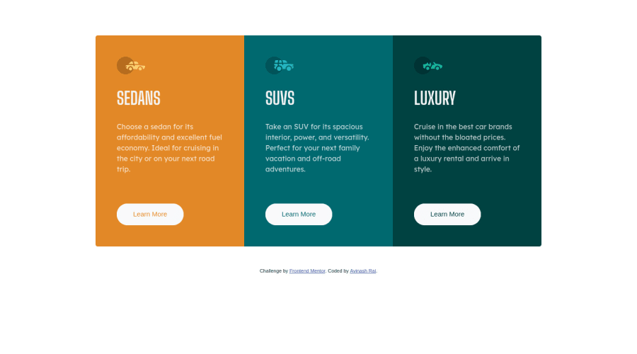
3column-preview-card-component using CSS Grid and Bootstrap
Design comparison
Solution retrospective
I am an absolute beginner and have tried to learn, please point mistakes, I am ready to improve.
Community feedback
- @palgrammingPosted over 3 years ago
well if you look at your desktop layout and see your border radius around it then make the browser narrow to mobile view and watch what happens to your rounded corners when the page transitions to mobile view. You will have to reset what corners have the border radius depending on page layout
Marked as helpful1@avi3101Posted over 3 years ago@palgramming what an eye to notice I get it, I will give it a try to improve it. That was very helpful, thank you.
1@palgrammingPosted over 3 years ago@avi3101 This is a long hard path with lots of moving parts. Just keep coding and keep learning. Some days will seems like everything works and other days will seem like nothing does... Do not give up is the important part
0@avi3101Posted over 3 years ago@palgramming That was a real boost for my confidence and I will keep coding no matter what the output maybe people like you are a true doing a great job, once again thank you.
1
Please log in to post a comment
Log in with GitHubJoin our Discord community
Join thousands of Frontend Mentor community members taking the challenges, sharing resources, helping each other, and chatting about all things front-end!
Join our Discord
