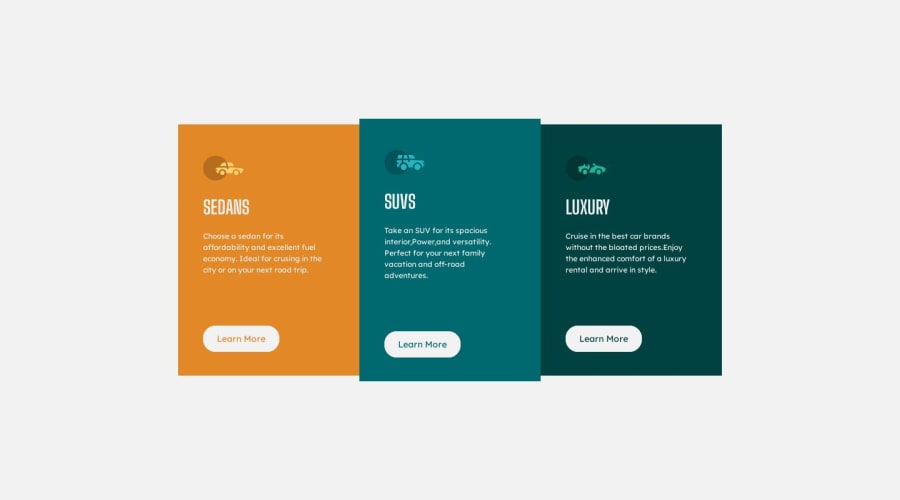
Design comparison
SolutionDesign
Community feedback
- @kimodev1990Posted 11 months ago
- It's better in the future to avoid giving your design sizes definite values such as your div with class .box width: 200px , It's better to give percentage values to make your design responsive with viewport dimensions. For example, you could assign class .card width: 30%; as you like it to be, So the width of your card will be 30% in relative to class .content width. This helps your design to be flexible growing and shrinking.
- Adding up to the previous point, If you need to assign definite values such as in your paddings, you could check on and use clamp ( ) method ( font-size, width, margins, paddings, etc. ) ,so your design sizes will change according to the viewport dimensions and will be suitable for any device layout. ( Responsive Design )
Hope you find this Useful & Helpful.
Other than that, Nice work & keep Going on.
Marked as helpful0@MahmoudHsnPosted 11 months agowhen I use the percentage the border-radius in .content doesn't work , do you know, why?@kimodev1990
0@kimodev1990Posted 11 months ago@MahmoudHsn because border-radius hasn't got a parent element to be relative to, So you should assign a definite value to it , then in this case It's better to use clamp ( ) so that your border-radius value will change responsively to viewport dimensions.
Marked as helpful0
Please log in to post a comment
Log in with GitHubJoin our Discord community
Join thousands of Frontend Mentor community members taking the challenges, sharing resources, helping each other, and chatting about all things front-end!
Join our Discord
