

Design comparison

Solution retrospective
Hello, are there any other ways to make this responsive?
Community feedback
- @pikapikamartPosted almost 3 years ago
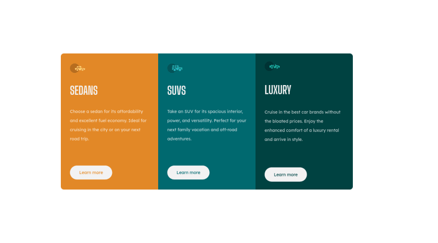
Hey, great work on this one. Desktop layout looks fine, it is responsive though the upper part when going into like tablet size is being hidden (suspecting vh in here), mobile state is fine though.
Rafael already gave feedback on this one, just going to add some suggestions as well:
- Don't use
width: 100vwsince this will only add a horizontal scrollbar at the bottom, since this value does not account the vertical scrollbar's width. - Avoid using
height: 100vhon a large container like thebodyas this makes the element's height capped based on the viewport/screen's height. Instead usemin-height: 100vhso that the element will expand if it needs to. - Inside the
main, why isolate the 3rd box and wrap the 1st and 2nd box inside of anotherdiv? You can just made use of:
main >div >div >divsectionin here is not needed and also,sectionas landmark is not informative unless it is labelled byaria-labelledby attribute. Changing it to using onlydivwould be better.- Those car icons are only decorative. Decorative images should be hidden for screen-reader at all times by using
alt=""andaria-hidden="true"to theimgtag or onlyaria-hidden="true"if you are usingsvginstead ofimgtag. - Only use descriptive
alton images that are meaningful and adds content to the site otherwise hide the image for screen-reader users. - On a site, always have a single
h1. Since there are no visible text that are suitable to beh1, theh1would be a screen-reader only heading. Meaning it will be hidden visually but present for screen-reader users. On this, theh1would have likesr-onlyclass and the text-content should describe what is the main-content is all about. Theh1could be placed as the first text inside themain.Have a look at Grace's solution on this one inspect the layout and see the usage ofh1as well the stylings applied to it. - Using
atag would be better for the learn-more since on a real site, those would be page links where user can "learn" more about a specific car.
Aside from those, great job again on this one.
Marked as helpful1@GodILoveTequilaPosted almost 3 years ago@pikapikamart Thanks a lot! This was super helpful, i really appreciate it! The reason why i added the top div and bottom div is so that i can make a media query for something in between phone and desktop size screens because it didn't liked the way the cards were shrinking in size.
1 - Don't use
- @StomperHKPosted almost 3 years ago
Yes. Put this CSS declaration inside the grid container. grid-template-columns: repeat(auto-fill, minmax(250px, 1fr));
Marked as helpful1@GodILoveTequilaPosted almost 3 years ago@StomperHK Thanks for the answer. Witch one do you think will take less time to accomplish? And is one or the other a best practice in this card context?
1@StomperHKPosted almost 3 years ago@GodILoveTequila In this case, it would be cool use Flexbox (at least for me), because you are controlling the items along the horizontal axis only, not both vertical and horizontal axis. I answered using grid-template-columns because it was the easiest way to answer your question... Unlike it would be if i used a flexbox code. But it's up to you.
Marked as helpful1


Please log in to post a comment
Log in with GitHub
Join our Discord community
Join thousands of Frontend Mentor community members taking the challenges, sharing resources, helping each other, and chatting about all things front-end!
Join our Discord