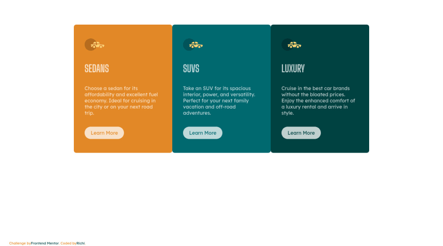
3-column-preview-card-component Done Using HTML and CSS with Flexbox
Design comparison
Community feedback
- @MadmandenPosted almost 3 years ago
Good stuff @AndresRicardo! There's a small issue to be aware of - on the mobile version it's no longer the same corners that need to be rounded, so in a media query you need to reset the rounded corners from the desktop design, and apply it to the top-left and top-right of the first card, and then bottom-left and bottom-right on the last card 😊
Marked as helpful1@AndresRicardoPosted almost 3 years agoReady, this was fixed
@Madmanden thank you very much
1 - @MadmandenPosted almost 3 years ago
Hi Andres! Looking good. A few issues I noted:
- There should only be rounded corners in the four corners of all three cards combined (not each individual card)
- The text color should be even whiter I believe (same with your buttons)
Marked as helpful1@AndresRicardoPosted almost 3 years ago@Madmanden I found another fails, icons of cars for example, jajaja thank yoy for your help.
0@MadmandenPosted almost 3 years ago@AndresRicardo Hehe, good catch, I didn't even notice that :)
Marked as helpful1@AndresRicardoPosted almost 3 years ago@Madmanden Hi Christian, thank you very much, i am going to check and fix that.
0@AndresRicardoPosted almost 3 years ago@Madmanden Ready, result fixed.
Thank you very much.
1
Please log in to post a comment
Log in with GitHubJoin our Discord community
Join thousands of Frontend Mentor community members taking the challenges, sharing resources, helping each other, and chatting about all things front-end!
Join our Discord
