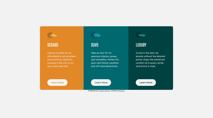
Design comparison
SolutionDesign
Solution retrospective
if you have any suggestions let me know <3
Community feedback
- @ChamuMutezvaPosted over 3 years ago
Nice work there.
<h1>SEDANS</h1>, words written in uppercase are read letter by letter when using screen readers. Write in lowercase and use css to transform the words to uppercase<button>Learn More</button>, in my opinion that should be a link to another page , anaelement would be the element of choice
Marked as helpful1 - @adimidaniaPosted over 3 years ago
Well done Safi! you did a really amazing job! the card is fully responsive and looking great!
You can add some space between the lines in the paragraphs using
line-heightproperty, also, for the body change the background color tohsl(0, 0%, 95%).Keep coding!
Marked as helpful1
Please log in to post a comment
Log in with GitHubJoin our Discord community
Join thousands of Frontend Mentor community members taking the challenges, sharing resources, helping each other, and chatting about all things front-end!
Join our Discord
