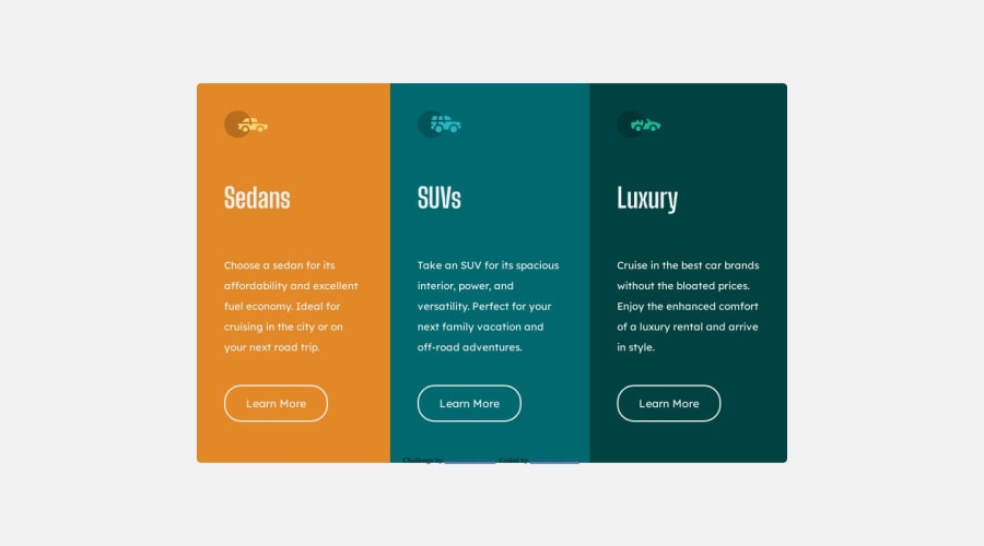
Design comparison
Solution retrospective
This Is My Second Challenges Here! , And I Really Enjoyed With Coding it 😁 That Means That Challenge is My Second Baby Step With Front-End Path Learning, So If You Found Any Best Practice To Improve My Code Feel Free Drop It In Comment And I Appreciate it ✌️ Happy Coding To You'll ✨
Community feedback
- @OmprakashRPosted over 1 year ago
Hi, ** congratulations **
correct your code there is a missing px
.container { display: flex; width: 60%; overflow: hidden; border-radius: 6px; -webkit-border-radius: 6p; -moz-border-radius: 6p; -ms-border-radius: 6p; -o-border-radius: 6p; }and change
alt =" "name as per images. in the attribute section change 100px to 10px for visible for all screen ratios..attribution { margin: 20px 0; position: absolute; bottom: 10px; }I hope this is helpful to you.
Thank You!!!
Marked as helpful0
Please log in to post a comment
Log in with GitHubJoin our Discord community
Join thousands of Frontend Mentor community members taking the challenges, sharing resources, helping each other, and chatting about all things front-end!
Join our Discord
