Design comparison
SolutionDesign
Community feedback
- @AkoToSiJeromeEhPosted 7 months ago
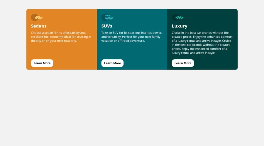
Hi there! Great work out there! I noticed that the 3 column preview card is not vertically aligned, and I recommend adding CSS properties to the body or specific element , such as d-flex ( that i see you add but missing some of its related properties) . Additionally, it's important to include min-height or height for proper alignment. By adding this to the body properties, you can achieve centering of the 3 column preview card. . I hope this suggestion helps and works for you. Happy coding!
body {
  background-color: #F2F2F2;
  display: flex;
  justify-content: center;
  min-height: 100dvh; // add this
  align-items: center; // add this
}
.container { margin-top: 50px;// you can remove this width: 80%; display: grid; grid-template-columns: repeat(auto-fit,minmax(20%,1fr)); height: fit-content; // add this because what happen is the card is spanning from top to bottom end . }Marked as helpful1
Please log in to post a comment
Log in with GitHubJoin our Discord community
Join thousands of Frontend Mentor community members taking the challenges, sharing resources, helping each other, and chatting about all things front-end!
Join our Discord
