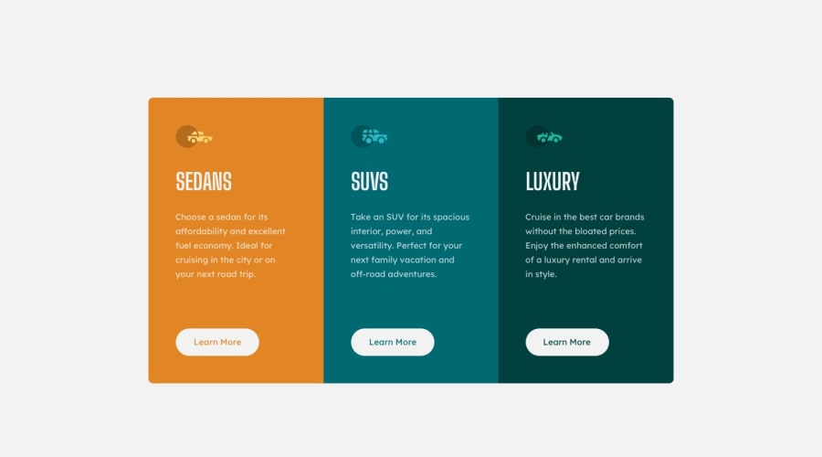
Design comparison
SolutionDesign
Solution retrospective
suggestions on improvements are greatly welcome
Community feedback
- @denieldenPosted over 2 years ago
Hi Manuel, great work on this challenge! 😉
Here are a few tips for improve your code:
- the html comments start with <!-- not <--
- Tip of graphic design: with
font-family:" Big Shoulders Display ", cursivethe browser will use the Comics Sans font when it doesn't find the first font indicated (you can seen during loading)... for the designer it's a really awful font! I would rather replace it with afont-family:" Big Shoulders Display ", sans-serifmuch more similar to the primary font. - add
maintag and wrap the card for improve the Accessibility - remove all unnecessary code, the less you write the better as well as being clearer: for example the
pcontainer of image - remove all
marginfrommotorcarsclass and body because with flex they are superfluous - use
min-height: 100vhinstead ofheightto body - add
transitionon the element with hover effect - instead of using
pxuse relative units of measurement likerem-> read here
Overall you did well 😁 Hope this help!
Marked as helpful1@manny-GMPosted over 2 years ago@denielden Thank you so much for this tips, i appreciate them
1
Please log in to post a comment
Log in with GitHubJoin our Discord community
Join thousands of Frontend Mentor community members taking the challenges, sharing resources, helping each other, and chatting about all things front-end!
Join our Discord
