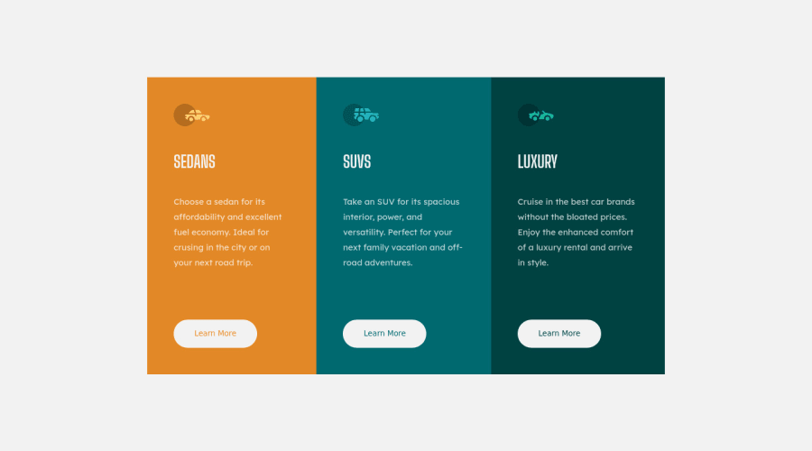
Design comparison
Community feedback
- @correlucasPosted about 2 years ago
👾Hello Chakiri, congratulations for your new solution!
You’ve done really good work here putting everything together, I’ve some suggestions you can consider applying to your code:
1.Make the first and the third card have the rounded borders with
border-radius: 14pxfor each of them.2.You made your html structure entirely with
div blocksbut these div doesn't any semantic meaning, for this reason is better you use a better html markup improving your code, for example for each vehicle card you use<article>instead of the<div>.This article from Freecodecamp explains the main HTML semantic TAGS: https://www.freecodecamp.org/news/semantic-html5-elements/
✌️ I hope this helps you and happy coding!
0
Please log in to post a comment
Log in with GitHubJoin our Discord community
Join thousands of Frontend Mentor community members taking the challenges, sharing resources, helping each other, and chatting about all things front-end!
Join our Discord
