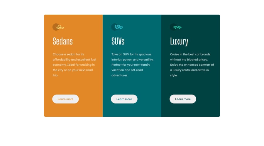
Design comparison
Solution retrospective
All feedbacks are welcome.
Community feedback
- @petritnurediniPosted 9 months ago
Congratulations on completing your project! It's fantastic to see your hard work come to fruition. Here are some best practices recommendations:
-
Code Organization: Great job keeping your HTML and CSS clean! For even better readability, consider adding more comments in your CSS to describe sections or specific styling choices. Learn more about CSS best practices here.
-
Responsive Design: You've implemented a responsive design for mobile view using media queries, which is excellent. As a suggestion, look into using relative units like
emorreminstead ofpxfor better scalability across devices. More on responsive design can be found here. -
Accessibility: Ensure that your website is accessible. This includes using semantic HTML and ensuring that the site is navigable and readable by screen readers. More about web accessibility can be explored here.
-
DRY Principle: In your CSS,
.col-btn-1,.col-btn-2, and.col-btn-3have many similar properties. You could create a common class for shared properties to adhere to the DRY (Don't Repeat Yourself) principle. Learn more about DRY in CSS here. -
Performance: Consider optimizing your images and assets for faster loading times. This could involve using modern image formats like WebP. Guidance on this can be found here.
-
SEO Practices: It's always good to keep SEO in mind. Use descriptive
titletags and meta descriptions. Learn more about SEO here.
Keep up the excellent work, and continue to explore and refine your skills. Your journey in web development is full of exciting opportunities and learning experiences!
Marked as helpful0 -
- @Ezekiel225Posted 9 months ago
Hello there 👋 @Viccyace.
Good job on completing the challenge !
Your project looks really good!
I have a suggestion about your code that might interest you.
There is an very useful browser extension called Perfect Pixel that allow you compare with the design image and thus see the exact dimensions. I recommend it to you.
Consider adding a min-height of 100vh to the body element so as to centralize your project.
body {
  min-height: 100vh;
  align-items: center;
  display: flex;
  justify-content: center;
}
I hope this suggestion is useful for future projects.
Keep up the excellent work and continue to challenge yourself with new projects. Your progress is impressive, and each project is a step forward in your front-end development journey! 🚀🌟.
Other than that, great job!
Happy coding.
Marked as helpful0
Please log in to post a comment
Log in with GitHubJoin our Discord community
Join thousands of Frontend Mentor community members taking the challenges, sharing resources, helping each other, and chatting about all things front-end!
Join our Discord
