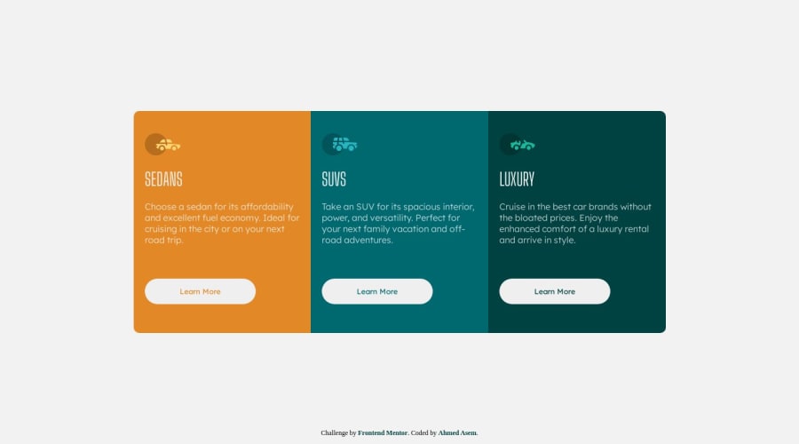
Design comparison
Solution retrospective
I used a CSS grid for styling i hope it is good enough waiting for comments.
Community feedback
- @Zy8712Posted 12 months ago
The desktop version of your site looks pretty good. Though there are some issues that arise when the screen size shrinks. On the mobile layout the top part of the sedans box gets cut off. This is primarily due to the usage of flexbox (I made the same mistake on this challenge as well). To fix it, when in the mobile layout you need to change
align-items: centertoalign-items: flex-startfor thebody.One other issue I noticed is that when the screen size is shrinking there is a certain screen width for which there are two boxes on one row and the last box has moved over to the next row. This is caused by the use of
display: grid. Though, I'd say this is a more minor issue and doesn't hurt the user experience.Hope this helps 👍
Marked as helpful1@A7MEDC7Posted 12 months agothanks so much for your comment Bryan it works perfect @Zy8712
0 - @MelvinAguilarPosted 12 months ago
Hello there 👋. Good job on completing the challenge !
I have some suggestions about your code that might interest you.
HTML 🏷️:
- Wrap the page's whole main content in the
<main>tag.
- Use the
<footer>tag to wrap the footer of the page instead of the<div class="attribution">. The<footer>element contains information about the author of the page, the copyright, and other legal information.
- You should use only one
<h1>tag per page. The<h1>tag is the most important heading tag, This can confuse screen reader users and search engines. This challenge requires thatSedans,SUVsandLuxuryare headings, but you can use the<h2>tag instead of the<h1>tag. You can read more about this here 📘.
- You should use the
<a>tag instead of the<button>tag because theLearn Morebutton is a link to another page. Use buttons to perform actions like submitting a form or closing a modal and use links to navigate to another page. You can read more about this here 📘.
I hope you find it useful! 😄 Above all, the solution you submitted is great!
Happy coding!
Marked as helpful1@A7MEDC7Posted 12 months agothanks so much, Melvin i modified my code, and now should be better have a good one @MelvinAguilar
0 - Wrap the page's whole main content in the
Please log in to post a comment
Log in with GitHubJoin our Discord community
Join thousands of Frontend Mentor community members taking the challenges, sharing resources, helping each other, and chatting about all things front-end!
Join our Discord

