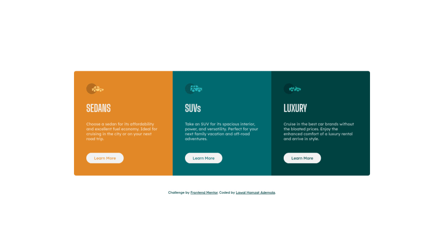
3-column-preview-card using HTML and CSS only
Design comparison
Solution retrospective
I just finished this challenge, it took me roughly two days, even though I was busy in my workshop I'M OPEN TO ALL SUGGESTION @vanzasetia, @grace-snow thanks so much for the previous comments on our challenges...you guys are amazing, I'll be happy to see you review this challenge.
Community feedback
- @grace-snowPosted over 2 years ago
Here are some suggestions for improvements
- footer does not go inside main. They are separate landmarks
- alt on the icons can be left blank - these are decorative
- it's unusual to have 3 h1s on a page. As this is a component that would likely sit on a fuller page, it would be more likely the headings would need to be h2s.
- I don't think a list is necessary for the markup of these cards. If in a plain document you wouldn't have all this content in a bullets list so there is no need to here. The semantic structure from the headings on each card is fine. If use divs
- you are setting the font size smaller than the style guide says. 0.8rem is equivalent to 12.8px (very small!) but the style guide says 15px. That means you should be using 0.9375rem
- Never style on IDs. It is not what they are for and you are increasing specificity for no reason. It can only cause problems
- margin does not need to be large on the component
- you can set border radius on the whole component along with overflow hidden. Shorter and means yiu don't need to set it on individual card corners
- the "Active" states in the design are actually communicating what should happen on hover. If you apply them on :active like that it will create a flash of the color change. You can set active and hover to be the same style if you want though
- interactive elements are all missing :focus-visible styles. These are extremely important for keyboard users. Choose something bold/obvious - usually a bold outline is what's used
- I wouldn't position buttons absolutely like that. Instead, consider making each card a flex column. That would allow you to place margin top auto on the buttons and push them to the bottom of each card
- consider adding a transition property to buttons for smoother color changing
- rather than changing the colors on each button, there is actually a blend mode you can use that would invert the text and background automatically for all of them. Just an idea
Marked as helpful4@EngineerHamzieyPosted over 2 years ago@grace-snow @grace-snow Thanks so much for taking your time. *Concerning this "Never style on IDs. It is not what they are for and you are increasing specificity for no reason. It can only cause problems" this is the second time I'll hear this, but I don't understand what "you are increasing specificity for no reason." means, I'll be glad if you have a material/video that you can recommend on that. because what I learnt earlier from some videos was "use ids for styling one thing and use classes for styling many things. And this is the second time I'll hear about the Specificity thing and I still don"t understand.
- I used active because that is what's written in the picture/design given, i don't like the result too.I'll just add :hover to it to make it look nice.
*OMG I was wondering why margin auto isn't working on the button so i had to use float instead, THANKS FOR THE TIP and TRICKS.
*Could you please explain this further or simplify: "interactive elements are all missing :focus-visible styles. These are extremely important for keyboard users. Choose something bold/obvious - usually a bold outline is what's used" and this "you can set border radius on the whole component along with overflow hidden. Shorter and means you don't need to set it on individual card corners"
*I think I'll need to read more on blend-mode later, I don't know it exist and I even tried Using it and it's not working.
*I was thinking jumping to an h2 without using h1 will introduce accessibility problem, thanks for the correction. *placing footer inside the main was a mistake, thanks for noticing
once again thank you so much. don't let this take all of your time...just answer it at your Convenience.
0@vanzasetiaPosted over 2 years ago@EngineerHamziey Let me answer some of the questions that you had.
- First, for the specificity, it's best to keep the specificity of the stylesheet as low and flat as possible. High specificity will make your stylesheet hard to maintain. Ideally,
id
should be used for anchoring (not for styling).- High specificity makes stylesheet harder to maintain because of the following reasons.
- It makes it hard to manipulate the styling. CSS is about manipulating. We have to use the
@media
query to overwrite the base styling. So, if the base styling has higher specificity than the selector in the@media
query, then it won't work. This might be not a big deal on a small project. But, on a large project where the CSS might contain 1000 lines then it's hard to debug when the issue happens. - It's best to make a habit of writing a low specificity stylesheet. This way, you are already getting used to writing a maintainable stylesheet.
- It makes it hard to manipulate the styling. CSS is about manipulating. We have to use the
- High specificity makes stylesheet harder to maintain because of the following reasons.
- Add
:focus-visible
styling to all anchor tags in this case. Usually, an outline would be great. In general, make sure that the:focus-visible
is clear and not the same as the:hover
styling. If you want to see an example, you canTab
through this page and you will see someoutline
on the interactive that you currently focus on.
.btn:focus-visible { /* some styling */ }
- You can set the
border-radius
on the parent element and then setoverflow: hidden
to all the card elements. After that, you can remove all theborder-radius
properties from the.cards
elements.
/** * 1. it will automatically make the * children elements obey the * border-radius of the parent element */ .card-container { border-radius: 0.4rem; overflow: hidden; /* 1 */ }
Hope this clears everything.
Marked as helpful3 - @denieldenPosted over 2 years ago
Hey Lawal, congratulations on completing the challenge! You did a very great job š
Tip of graphic design: with
font-family:" Big Shoulders Display ", cursive
the browser will use the Comics Sans font when it doesn't find the first font indicated (you can seen during loading)... for the designer it's a really awful font! I would rather replace it with afont-family:" Big Shoulders Display ", sans-serif
much more similar to the primary font.Hope this help! Happy coding š
Marked as helpful2 - @vanzasetiaPosted over 2 years ago
Hi, Hamzat! š
I get the chance to online today, so here is some feedback from me.
- Use CSS to uppercase the text. The uppercased word in the HTML might be spelled by the screen reader (spelled letter by letter).
- Remove the commented code. If another developer (it can be you in the future) wants to improve this solution, he/she might get confused about whether or not the commented code should be used or deleted.
- I recommend changing the
attribution
font size torem
instead ofpx
. - I suggest adding
width
andheight
attributes to eachimg
element. It is used to create a placeholder while the images are not fully loaded. As a result, it prevents the jumping layout (decreasing the Cumulative Layout Shift). If you want to learn more about CLS, I recommend reading the article from web.dev about it.
Overall, you've done great work on improving your solution based on the previous feedback. Good job with it! š
That's it! Hope you find this useful!
Marked as helpful1@vanzasetiaPosted over 2 years ago@EngineerHamziey No problem! It makes me happy to help! š
1@EngineerHamzieyPosted over 2 years ago@vanzasetia
-
now I'm starting to feel like a real web developer (lol) with the help of everyone here, most especially you (obviously).
-
the first time I submitted a project and it had some accessibility issues, I asked a friend of mine and he told me to ignore them, but deep in my mind, I wish to become a standard front-end developer so that I can get a life changing job in the future.... so I want to be perfect....though I'm still at the begging.
-
You know I'm so happy when I detect Frontend Mentor, and I became happier when I came across one of your comments and @grace-snow on someone's project it was so explanatory.
-
My plan is to finish all free projects on HTML & CSS, ask for feedback correct the code then write another one that has a lot of comment explaining what the code from A - Z then use it to help others then I'll so the same for all free JavaScript projects here too.
-
I can now think of learning a frameworks for CSS and JS, one for each and start hunting for job after a lot of practice.
I hope this is a good plan. Everyone should feel free to join the discussion. š š. Do people even see it when you tag them š¤? Let's see
@grace-snow
@shashilo
@mattstuddert
0@grace-snowPosted over 2 years ago@EngineerHamziey doing all the projects sounds like a lot, pretty much a full time job! (Remember new challenges are added every 2 weeks)
Just focus on code quality and doing the projects you need to practice whatever you are trying to learn at the time
Marked as helpful1@EngineerHamzieyPosted over 2 years ago@grace-snow š wow "...every two weeks". Ok thanks so much. I'll try to build as many as possible then move on.
0@vanzasetiaPosted over 2 years ago@EngineerHamziey It's great that you start feeling confident with your skill. š
For your information, in my experience, there would be the time when I doubt my skill and then feel confident again and it keeps repeating. š
So, keep learning, and as Grace has said to you focus on the code quality.
Also, don't forget to give feedback to others as well. It's going to reinforce the knowledge that you already have and it feels great to be able to help others. š
Marked as helpful1@EngineerHamzieyPosted over 2 years ago@vanzasetia š Yes, I'm doing my best at giving feedback too. Thanks alot. š š.
1 - @EngineerHamzieyPosted over 2 years ago
Please I forgot to ask What do they mean by "the design sis created in the following widths: -Mobile: 375px -Desktop: 1440px" Are they referring to media queries or max-width ?
0@grace-snowPosted over 2 years ago@EngineerHamziey neither. Those are the sizes of the design images, nothing more. They are nothing at all to do with code. It's saying "this is how your solution should look at these widths". As frontend developers we make it look good at allllllll sizes and zoom levels, but designs handed to us will always be at static sizes to give us a guide
Marked as helpful1 - @EngineerHamzieyPosted over 2 years ago
One of the problem I'm facing is , I'm using latitude 2100 š© That has a width of 10.1 inches 1024px...I'll get another one soon, hopefully š I'm disappointed to see that my design is so small than the actual design.
@vanzasetia @grace-snow... I'll love to hear your review.. I always like to hear from you guys.. I've learnt alot from your comments and solution
0
Please log in to post a comment
Log in with GitHubJoin our Discord community
Join thousands of Frontend Mentor community members taking the challenges, sharing resources, helping each other, and chatting about all things front-end!
Join our Discord