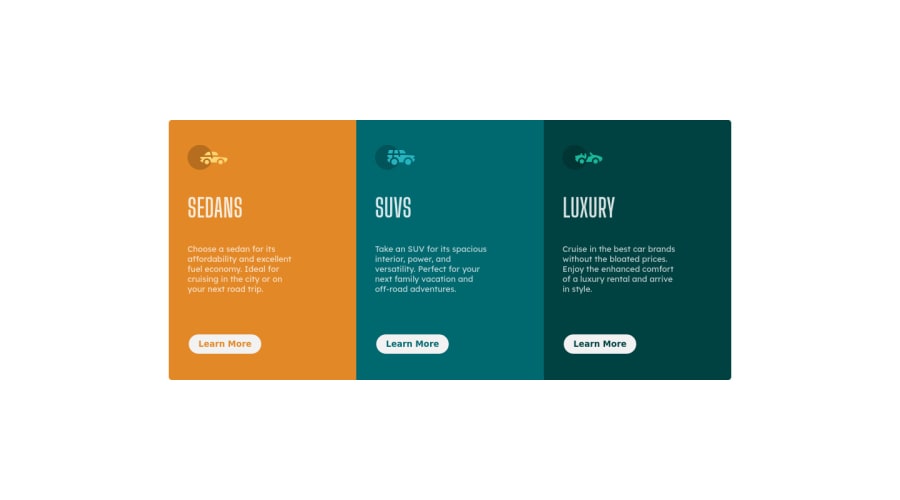
Design comparison
Solution retrospective
Hi, I just finished this challenge. I'm down for any kind of praises as well as constructive critics. Please let me know if you have other cool ideas to make my coding style more accessible and structured. Thx ;)
Community feedback
- @SamadeenPosted over 2 years ago
Hey!! Cheers š„ on completing this challenge.. .
Here are my suggestions..
- You should wrap your
divs
andheading
with yourimg
in amain
tag. - You should also avoid inline styling since you already have a style sheet
This should fix most of your accessibility issues
. Regardless you did amazing... hope you find this useful... Happy coding!!!
Marked as helpful0@TayAki79Posted over 2 years ago@Samadeen how's it going? Hope you're doing fine.
- Well so you mean like this?
- ok. i move the styles in my style sheet. your absolutely right. =D
would you mind checking out my github again?
https://github.com/TayAki79/3-column-previewcard/blob/2dedfad6ec7ff59564fadcc5005422dcf26c00bf/improvement
0@SamadeenPosted over 2 years ago@TayAki79 `<body>
<main> <section> </section> </main> </body>`0 - You should wrap your
Please log in to post a comment
Log in with GitHubJoin our Discord community
Join thousands of Frontend Mentor community members taking the challenges, sharing resources, helping each other, and chatting about all things front-end!
Join our Discord