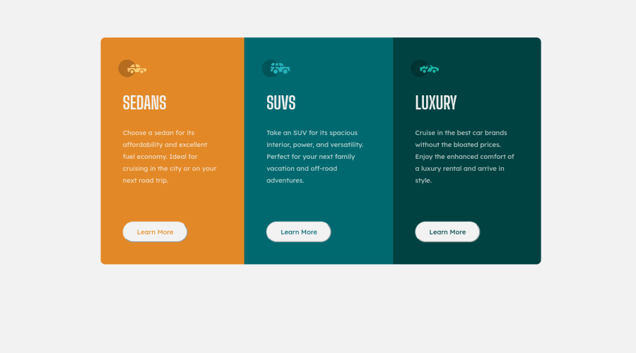
Design comparison
Solution retrospective
Hello, this is my second challenge, I would appreciate in advance some recommendation regarding the design, thanks.
Community feedback
- @Yashasvi2704Posted over 3 years ago
Hi @Marlonsz36,
Good to see the use of
:first-childand:last-childselectors. Makes the solution way more flexible than mine.One thing that I spotted was
1.On changing responsiveness, some cards have different heights do to the difference in content of each card.
Different Height Card Fix.
1.You know flexbox as you used it in you cards. You could use it in the card
.card-bodyitself to line up the items vertically .. 2. Instead of of having a fixed margin-bottom on the paragraph, you can just have an defined height for your
.card-bodyelement and vary the padding between the elements usingpadding-bottom:auto.Marked as helpful0
Please log in to post a comment
Log in with GitHubJoin our Discord community
Join thousands of Frontend Mentor community members taking the challenges, sharing resources, helping each other, and chatting about all things front-end!
Join our Discord
