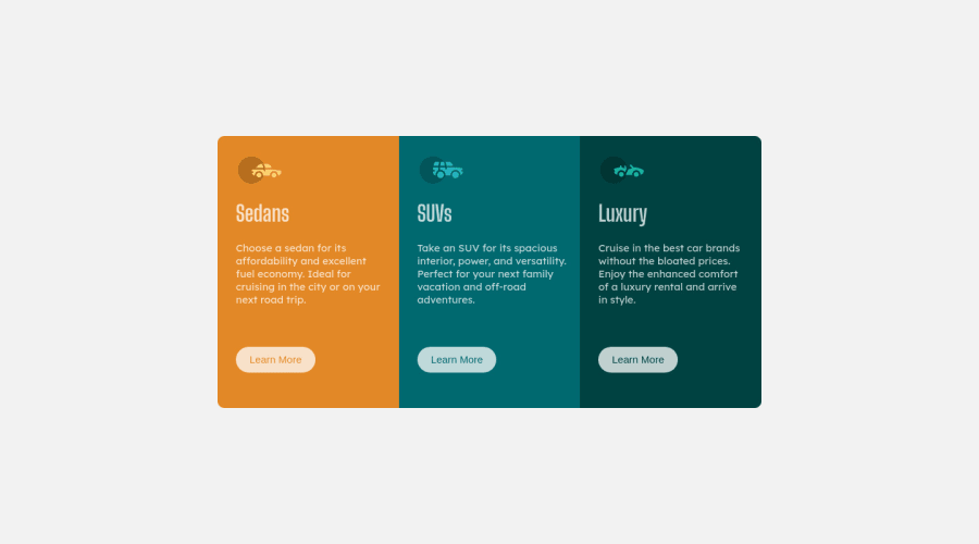
Design comparison
Solution retrospective
Hey folks, Please checkout my solution and give a feedback, a little help goes a long way.. there's definitely a learning curve, any suggestion which CSS framework would be more effective and more easier to learn
Community feedback
- @VCaramesPosted about 2 years ago
Hey @payalpagaria, some suggestions to improve you code:
-
The car images/icons serve no other purpose than to be decorative; They add no value. Their Alt Tag should left blank and have an aria-hidden=“true” to hides it from assistive technology.
-
The headings are being use incorrectly. For this challenge, each heading is equally as important. So best option, is to use <h2> Heading, because it will give each card the same level of importance and it's reusable.
-
Your "buttons" were created with the incorrect element. When the user clicks on the button they should directed to a different part of you site. The Anchor Tag will achieve this.
-
Your component is not responsive. You need add a media query to it.
Happy Coding! 👻🎃
Marked as helpful1@payalpagariaPosted about 2 years ago@vcarames Thanks for the suggestion buddy, will keep it in mind .
0 -
- @correlucasPosted about 2 years ago
👾Hello @payalpagaria, congratulations on your new solution!
I’ve some suggestions for you:
1.You’re in the right track I can see that you’ve used the majority semantic tags possible for this challenge, the only block you’ve missed is the paragraph containing the
quote text
you can improve the accessibility there using<blockquote>
to indicate to screen readers that the content inside that paragraph is a quote.2.Don’t use
id
to give the style of your elements, it's not a good idea becauseid
is a too specific selector used forforms
and Javascript code. Instead, useclass
for styling and let theid
for much specific stuff. It's also not advisable to use IDs as CSS selectors because if another element in the page uses the same/similar style, you would have to write the same CSS again. Even if you don't have more than one element with that style right now, it might come later.✌️ I hope this helps you and happy coding!
Marked as helpful0@payalpagariaPosted about 2 years ago@correlucas hey thanks a lot for the suggestion would take that in mind while working on the next task..
0
Please log in to post a comment
Log in with GitHubJoin our Discord community
Join thousands of Frontend Mentor community members taking the challenges, sharing resources, helping each other, and chatting about all things front-end!
Join our Discord