Design comparison
Community feedback
- @daniloparrajrPosted over 2 years ago
Hi Mohamed! 👋
Looking good with your work here! Keep it up!
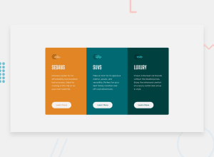
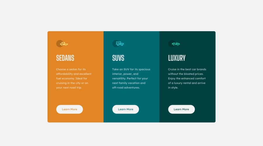
One suggestion is to add the border initially in the buttons instead on hover so the cards will still be the same height.
You can also improve your implementation by changing the cards text length and check if the cards still align with each other and if the button always remain in the bottom.
A quick giveaway is to use flex direction of column and margin top auto! Good luck and have fun!
0 - @ozeechristinePosted over 2 years ago
Hi!! Your design looks amazing. Yiu did a really good job.
I think you should adjust the bottom left border radius of the first card and the top right border radius of the third card to straighten it out.
0
Please log in to post a comment
Log in with GitHubJoin our Discord community
Join thousands of Frontend Mentor community members taking the challenges, sharing resources, helping each other, and chatting about all things front-end!
Join our Discord
