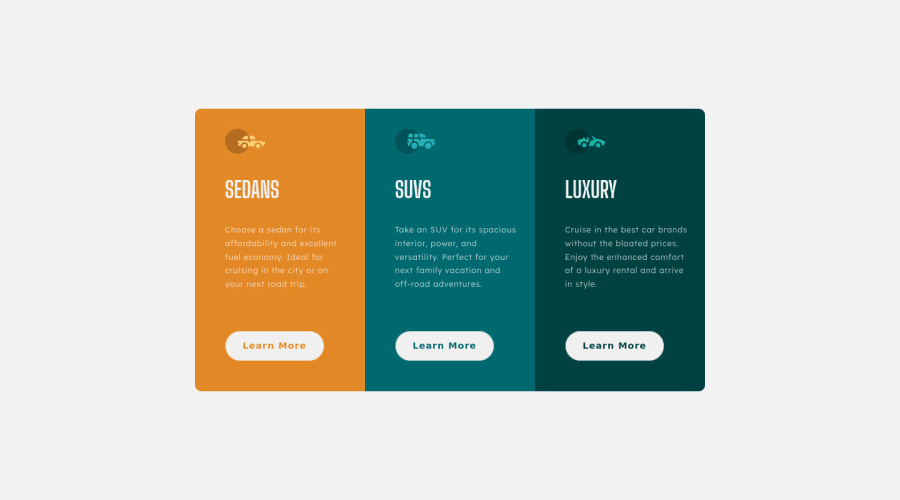
Design comparison
Solution retrospective
The desktop version looks okay to me. The thing that is frustrating me is mobile view. My media query is not working at all. If I try the mobile styling in an independent css file, it works fine but breaks when I use it as media query. I am at my wits ends now. Please help me!
Community feedback
- @CarlPericles18Posted about 3 years ago
Hey!
When you starting, if using chrome inspect and set the dimension to a mobile device and build it as the design show for the project, then use min-width for media query when done with mobile to start on desktop view. Search up The Net Ninja on youtube on the responsive build, he goes more in-depth. Other than that it looks good, also the border-radius on mobile was off in the bottom-left and right.
Hope this helps.
Marked as helpful0 - @KTaylor00Posted about 3 years ago
Hey!
In your .container class in the media query you can add, grid-template-columns: 17rem; That should stack them on top of one another.
I hope this helps:)
Marked as helpful0@Mahwash-AlyPosted about 3 years ago@KTaylor00 Yes, it did stack them on top of one another. Thank you! But I still don't understand the mechanics :(
0@KTaylor00Posted about 3 years ago@SamiaMahwash
Awesome:)
Sorry, maybe have a look at this: https://www.youtube.com/watch?v=m04RkJwzFgE and this: https://www.youtube.com/watch?v=_lEkD8IGkwo. He is also really good to follow with regards to CSS.
Marked as helpful0@Mahwash-AlyPosted about 3 years ago@KTaylor00 I have been following him for a few months now but never really checked his videos much. I will do that now. Thanks!
1 - @pikapikamartPosted about 3 years ago
Hey, awesome work on this one. Layout in desktop looks great, though the responsiveness could be better because at around 820px going down to the mobile layout, your content is being hidden hence creating a horizontal scrollbar. The mobile layout needs to make the
font-size
a bit bigger since it is hard to read it by now.Some other suggestions would be:
- Instead of just waiting for the 475px breakpoint, you could start it around 820 so that you will avoid the issue of element being hidden or you could make a separate breakpoint where you like create a 2x2 layout, where the 3rd card is at bottom, just an idea if you would want.
- Also, since you are starting out, I suggest that you learn mobile layout and use it as your main layout for workflow. This will make you handle responsiveness a lot better and always as well use the dev tools to try changing the screen's width and checking if the layout still looks good.
- Each car icon should be hidden since they are only decorative so use
alt=""
and add extraaria-hidden="true"
attribute on theimg
element. - Avoid using multiple
h1
on a page. Use only 1h1
per page and since there are no visible text-content that could beh1
on this, you will make theh1
a screen-reader only text, meaning it will be hidden for sighted users and screen-reader users will only be able to informed about it. Take a look as well of Grace's solution inspect the layout and see howh1
is used as well the styling on it, copy those and you will use that a lot. Change all theh1
toh2
. - Using
a
tag instead ofbutton
is more suitable in here since it is more likely a link to "learn more". - Also
button
doesn't need aname
attribute, you use this oninput
element.
Aside from those, great work again on this one.
0@Mahwash-AlyPosted about 3 years ago@pikamart Thank you so much for your feedback. I changed a few things as you suggested. I will try to implement 2x2 grid layout for 820px in coming days. Thanks again for being such help!
1
Please log in to post a comment
Log in with GitHubJoin our Discord community
Join thousands of Frontend Mentor community members taking the challenges, sharing resources, helping each other, and chatting about all things front-end!
Join our Discord