Design comparison
Community feedback
- @xsaulPosted over 2 years ago
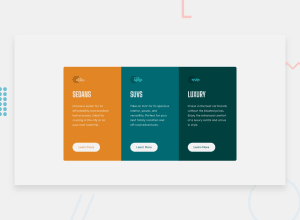
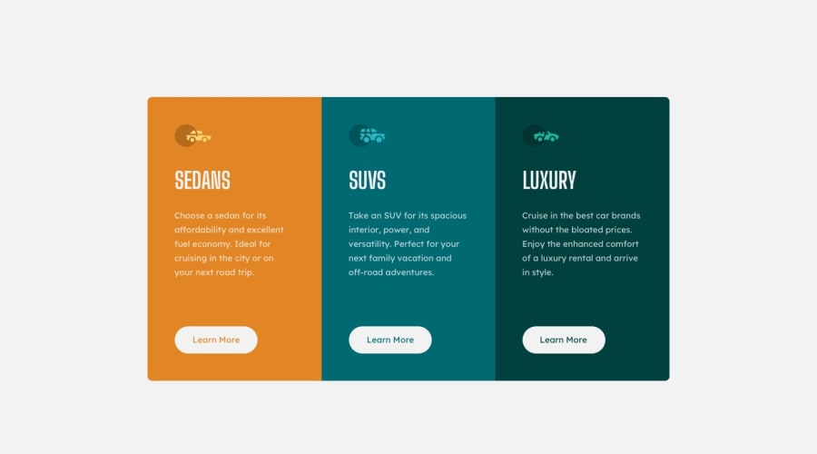
Hello Ololade, you have many things to improve in your work. The hover of the buttons should be the same color as the background of each section, plus you should add a transition to make it look nicer. You forgot to add the icons at the top. And use the font recommended for the challenge.
0@ololade2002Posted over 2 years ago@xsaul Thank you so much I added the icons ,I don’t know why it’s not showing
0@xsaulPosted over 2 years ago@ololade2002 I checked it out in the console and you have 4 errors with the 4 icons (including the frontend mentor icon in the tab). And checking your GitHub repository I can see that you didn't include the folder with the images so that's why the HTML can't find and display them.
0 - @phoenixrxPosted over 2 years ago
Hello, you can use the recomended fonts importing them on the main.css file whit the following code: @import url("https://fonts.googleapis.com/css2?family=Lexend+Deca&display=swap"); @import url("https://fonts.googleapis.com/css2?family=Big+Shoulders+Display:wght@700&family=Lexend+Deca&display=swap");
0
Please log in to post a comment
Log in with GitHubJoin our Discord community
Join thousands of Frontend Mentor community members taking the challenges, sharing resources, helping each other, and chatting about all things front-end!
Join our Discord
