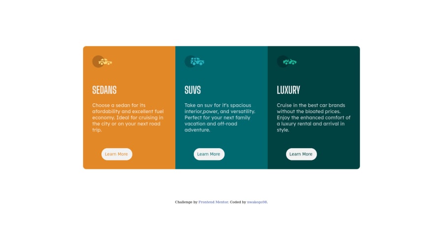
Design comparison
Solution retrospective
I couldn't get the styling for the active state, please can I get a correction on that? And can I please get a correction on my mobile if any?
Community feedback
- @correlucasPosted about 2 years ago
👾Hello Glow, congratulations for your new solution!
Answering your question. Here's how you can create the hover effect:
button:hover { border: 2px solid white; background-color: hsl(0deg 0% 95% / 0%); transition: ease 0.3s; }
👋 I hope this helps you and happy coding!
Marked as helpful0 - @PhoenixDev22Posted about 2 years ago
Hi Glow,
Great work! Congratulation on completing this challenge. I have some suggestions regarding your solution if you don't mind:
- You can use the
<main>
landmark to wrap the body content (which is the three cards).
- About
<h1>
it is recommended not to have more than one h1 on the page . Multiple<h1>
tags make using screen readers more difficult, decreasing your site’s accessibility. You can add a<h1>
withclass="sr-only"
(Hidden visually, but present for assistive tech).Then swap those<h1>
by<h2>
.
- In this challenge , the images are much likely to be decorative. For any decorative images, each img tag should have empty
alt=""
as you did andaria-hidden="true"
attributes to make all web assistive technologies such as screen reader ignore those images .
- What would happen when the user click those learn more? In my opinion, clicking those "learn more" would likely trigger navigation not do an action so button elements would not be right. So you should use the <a>. For future use , it's a good habit of specifying the type of the button to avoid any unpredictable bugs.The hover effect is missing on them , you should add it.
- Don't capitalise in html, let css text transform take care of that. Remember screen readers won't be able to Read capitalised text as they will often read them letter by letter thinking they are acronyms.
- You Should Indent Your Code. With unindented code, the overall structure of the code might be somewhat difficult to see
Aside these, your solution is good. Hopefully this feedback helps.
Marked as helpful0 - You can use the
- @HammadEngrPosted about 2 years ago
Hi Glow ! Overall good solution. but you can also do it using css grids, do try grid technique. Create a div and set display to grid. set grid-template-colums: auto auto auto, it will make 3 columns. create 3 divs in it which will make 3 columns. and add the content in these divs.
display: grid; grid-template-columns: auto auto auto; margin: 7% 15%; }```
Marked as helpful0 - @dazzlerabhi30800Posted about 2 years ago
Ok this 1st - about the design - You should change the body background color to some dark color, 2nd - instead of using margin top property you should use align-items: center 3rd - instead of flex property on container you should use grid property that will fix the overflow of design 4th - to fix accessibility issues you should wrap the whole container inside main tag! 5th - most important your approach should be mobile first. Thank You and have a good day!
Marked as helpful0
Please log in to post a comment
Log in with GitHubJoin our Discord community
Join thousands of Frontend Mentor community members taking the challenges, sharing resources, helping each other, and chatting about all things front-end!
Join our Discord