Design comparison
SolutionDesign
Solution retrospective
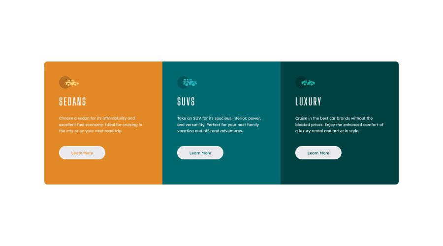
This is my solution to this challenge. Feel free to comment with any suggestions so that I can improve my skill. Thank you!
Please log in to post a comment
Log in with GitHubCommunity feedback
- @darryncodes
Hi Ibrahim,
Overall a really decent solution and responsive - well done!
A few bits of feedback for your consideration:
- add
{cursor: pointer;}to your buttons - swap
<div class="grid container">to a<main>. Semantic html is really important for accessibility and it should clear your report. - look into max-width to control the width of your content in a responsive way, rather than using width with percentage values. This would help your design not to stretch across the viewport at larger screens too
- I noticed at different viewports your buttons are not aligned. Also if the content in the
<p>were different lengths in the design you'd come up against the same challenge. I created this codepen that usesflex:1andjustify-content: space-betweenas potential solutions
I hope that all makes sense, any questions let me know.
Happy coding!
- add
Join our Discord community
Join thousands of Frontend Mentor community members taking the challenges, sharing resources, helping each other, and chatting about all things front-end!
Join our Discord
