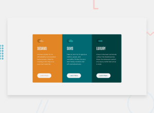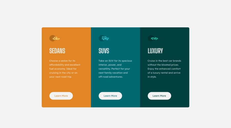
Design comparison
SolutionDesign
Solution retrospective
feedback, please!
Community feedback
- P@hardy333Posted over 3 years ago
Hey, nice solution, good job.
Few corrections you might do for improving design:
- try to use less space between card icon/image, text and button.
- Add hover effects on buttons and also cursor:pointer;.
- remove border-radiuses on left end right cards on right and left corners respectively.
- Try to center cards on screen - vertically
Good Luck.
Marked as helpful3 - P@kens-visualsPosted over 3 years ago
Hey @mahnoork18 👋🏻
- In your markup, <div class="attribution">...</div> should be <footer class="attribution">...</footer>. These will fix the accessibility issues. Don't forget to generate a new repot once you fix the issues.
- For this image
<img class="icon" src="images/icon-music.svg" />, I'd put aria-hidden="true", since in this case the icons are for decorative purposes. Mainly, you should use an alt tag when the image should have some sort of description and is not used for decoration, such as, these icons. - Also, you may need to change
margin-lefton button to40px, so it aligns with the text.
I hope this was helpful, good job on the project. Cheers 👾
Marked as helpful1@mahnoork18Posted over 3 years ago@kens-visuals thanks for the feedback really helpful :)
0
Please log in to post a comment
Log in with GitHubJoin our Discord community
Join thousands of Frontend Mentor community members taking the challenges, sharing resources, helping each other, and chatting about all things front-end!
Join our Discord
