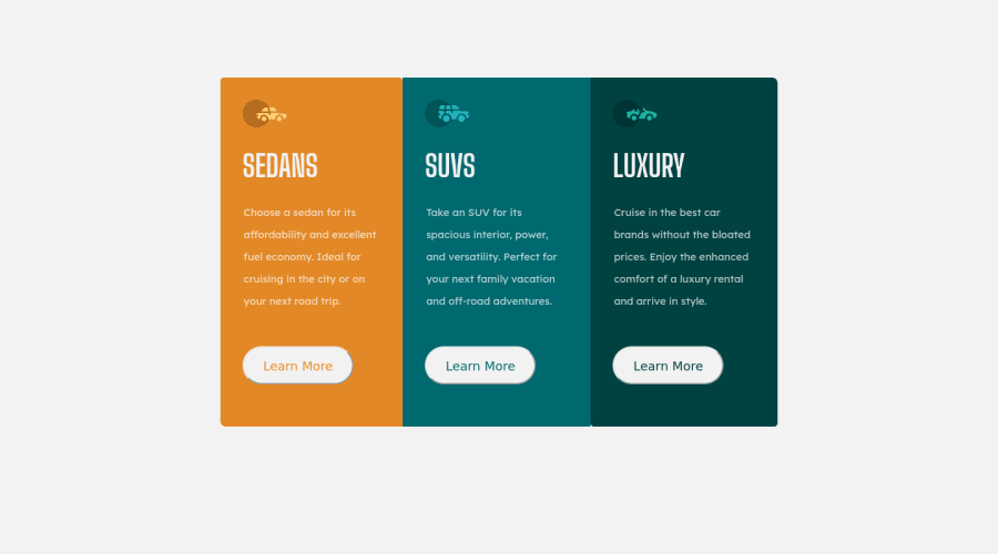
Design comparison
Solution retrospective
any feedback is welcome!
Community feedback
- @pikapikamartPosted almost 4 years ago
Hey, great work on this one. Points for not using
height: 100vhin here (really advocates not using it :>).The layout is really good both in desktop and mobile
My suggestions would be that. Well this kind of personal preference right
-
Default border. It will be awesome if you remove the default border in the
buttonelements. If you look at the button, there is a black lines surrounding it and that is the default. You could justborder: nonein thebuttonselector. -
Center. In your mobile state, your layout is onto the left side. It will be better(well for me) for you to make it centered. So adding
margin: 0 autoin yourboxOfboxesselector will be really awesome.
Everything seems good. In terms of markup, I think you using too much element, like for the button, you nested it inside of a 2 div.
But still, you did a really awesome work^^
1 -
- @superozzyPosted almost 4 years ago
hey thanks for the advice,i updated your suggestions,it really looks better with the border:none;!Thank you very much : )
0
Please log in to post a comment
Log in with GitHubJoin our Discord community
Join thousands of Frontend Mentor community members taking the challenges, sharing resources, helping each other, and chatting about all things front-end!
Join our Discord
