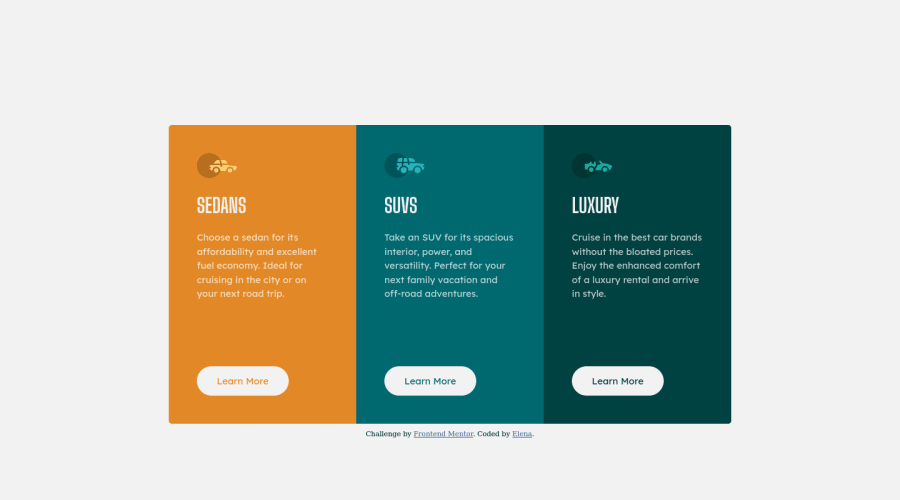


Design comparison

Solution retrospective
Tadaaa! This is my first frontendmentor challenge (and my second HTML/CSS project ever). I am still very new to this but had lots of fun building this component. But I'm sure it can be improved a lot! Any input appreciated. But I also have a few specific questions.
-
I feel like I created the layout very very clumsily. Adjusting positions using different margin/padding values felt arbitrary and complicated to me. I am sure there are more simple ways to position elements, and in a more uniform way, too.
-
I am also very unsure about the responsiveness of the layout with different screen sizes. I used a cutoff of 900px. If the device width is smaller, the layout will change to a column. The card does not change its size otherwise, and a part would be off screen. Is this how it's done? Would it be better to decrease the container's size along with the width of the screen?
-
I used a combination of BEM and ITCSS methodologies to structure my CSS file. I know this is absolutely unnecessary for this tiny of a project, but I am trying to find a good way to structure my CSS files and practice it. Did I do it correctly? Does anyone have better suggestions as to how to structure CSS files well?
Any input appreciated.
Thanks a lot!
Elena
Community feedback
Please log in to post a comment
Log in with GitHub
Join our Discord community
Join thousands of Frontend Mentor community members taking the challenges, sharing resources, helping each other, and chatting about all things front-end!
Join our Discord