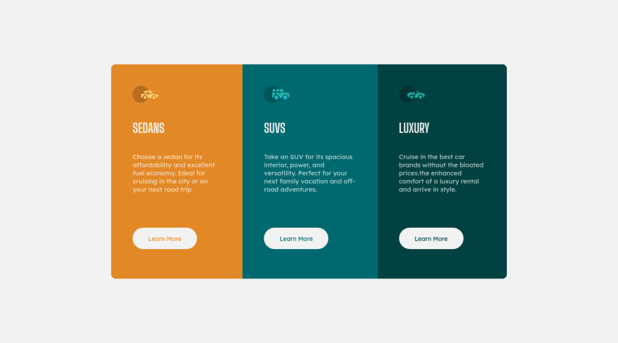
Design comparison
SolutionDesign
Solution retrospective
plis check for the mobile view
the only thing i cant did was to put my button at the end of the flex-box container any suggestion? i had to do it with margin :(
Community feedback
- @anjorraoPosted over 3 years ago
Hi, You can wrap card-title, image and p in single div and use
justify-content: space-betweenproperty to flex items and avoid margin. https://developer.mozilla.org/en-US/docs/Web/CSS/justify-content Hope this helps :)0
Please log in to post a comment
Log in with GitHubJoin our Discord community
Join thousands of Frontend Mentor community members taking the challenges, sharing resources, helping each other, and chatting about all things front-end!
Join our Discord
