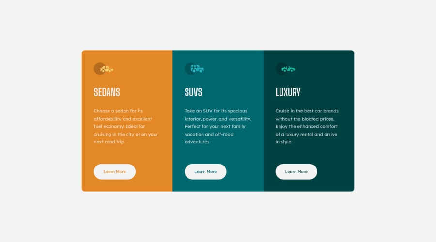
3-column-card-component using HTML and CSS(responsive design).
Design comparison
Solution retrospective
Hello everyone, I tried completing this challenge using simple HTML and CSS. Please check and give your feedback.
Community feedback
- @thomashertogPosted over 3 years ago
first things first, please fix the accessibility issues from the report aside from that you might want to look into the semantics of your HTML for example: those "learn more" buttons, are they buttons? in my perception these are links to a place where there is more infomation
Marked as helpful1@nandini2201Posted over 3 years ago@thomashertog Thank you for your feedbback. I'l do the required changes.
0 - @ChamuMutezvaPosted over 3 years ago
Well done , you did well. The site is responsive. The middle card has some borders on some of edges, that is the only thing that i can say is missing.
Marked as helpful1 - @afrusselPosted over 3 years ago
Hi, nice work, it will be better if you use main after body tag like this
<main class="container">Marked as helpful1
Please log in to post a comment
Log in with GitHubJoin our Discord community
Join thousands of Frontend Mentor community members taking the challenges, sharing resources, helping each other, and chatting about all things front-end!
Join our Discord
