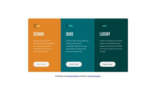
@freaky4wrld
Posted
Hey there, I guess there's a need to make your solution more close to the design specifications....
- you don't have to make your body element flex, instead make your main element a flex, so that your cards go side-by-side
- then on reaching the mobile-version width, set the flex-direction to column, so that they become as they are now....
I would recommend you to have a good look on flex and mobile-responsiveness
Do have a look on this playlist----> Brad Traversy it contains everything you need right now
Hope it helps...... glad to help :)
@Tomomi-K1
Posted
Hi @freaky4wrld
Thank you for the suggestions!šš»
I don't think I understood this assignment correctly. My design does not gradually change but it changes layout when it gets to over 1440px(desktop size according to figma file) since I made it mobile first.
I put flex on body to center the cards in the middle of screen. Is it a bad practice? How would you usually do?
Thank you again for your comment!
@freaky4wrld
Posted
@Tomomi-K1
To center the cards you can use the below code.....
main{
width: [some-value]%;
margin: [some-value]rem/em auto;
}
- first I gave the main content a width in percentages.....
- then a top and bottom margin in rem/em units
- and made the browser to select the left and right margin
This will do the work...... hope it resolves your query
@Tomomi-K1
Posted
Hi @freaky4wrld,
Thank you for replying to my question!š I learned the another way to do it!