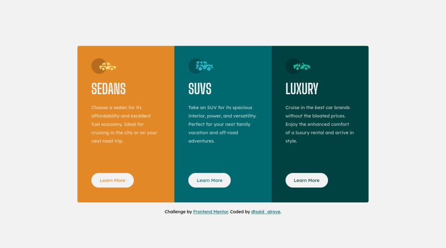
3-column-card component with Grid and Flexbox (CSS only)
Design comparison
Solution retrospective
Hi, what's up? How I mentioned in my last solution, I'm rebuilding some projects that I had already done, but now with the knowledge that I didn't have (in this case, I didn't do too much because I had done this solution with CSS only, so the only difference that I did was in the HTML with the way how I structured it, and with a more organized CSS in contrast to the solution I created some weeks ago).
But as always, feedback is always appreciated :D!.
P.D. I've already said this in the other solution, but anyways it's important to mention it. In this project, I've implemented the use of logical properties such as inline-size (width), and block-size (height) due to nowadays there's already enough browser support for them.
Community feedback
Please log in to post a comment
Log in with GitHubJoin our Discord community
Join thousands of Frontend Mentor community members taking the challenges, sharing resources, helping each other, and chatting about all things front-end!
Join our Discord
