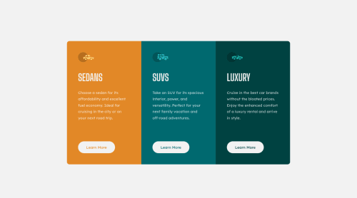
Design comparison
Solution retrospective
This was more challenging than I thought it would be. I don't fully understand grid yet. Working on it. I always end up feeling my code could've been cleaner. Also, first attempt to implement BEM. I haven't grasped it yet. :) Feel free to comment!
Community feedback
- @Kamasah-DicksonPosted almost 2 years ago
Your solution looks great and to help you with the accessibility issue 1.There should always be an h1 in your projects. It should be the first head tag you use. And should reduce in descending order. h1....h6
Happy coding🎉
1@LorenaFriasPosted almost 2 years agoHello @Kamasah-Dickson!
I really appreciate your feedback! l know I shoud've used an h1 tag, I just didn't know where. Because you're supposed to use just one per page, right? Maybe removing it from the flow?
0@Kamasah-DicksonPosted almost 2 years ago@LorenaFrias I really understand you, in your case the h1 should be the head of the first card. the h tags just helps in accessibility so you just need to make sure there is an h1 tag and that you change the font sizes of all the headens to your liking. The tags just helps in accessibility under the hood
0 - @Mario97MPosted almost 2 years ago
Looks good. I would say for this project all you need is flexbox, not grid. Grid is good if your your containers go in two dimensions, both horizontal and vertical, Flexbook is good if you only have one dimension. Since these containers are only going horizontal, flexbox is all you need.
0
Please log in to post a comment
Log in with GitHubJoin our Discord community
Join thousands of Frontend Mentor community members taking the challenges, sharing resources, helping each other, and chatting about all things front-end!
Join our Discord