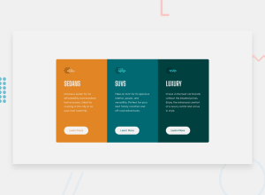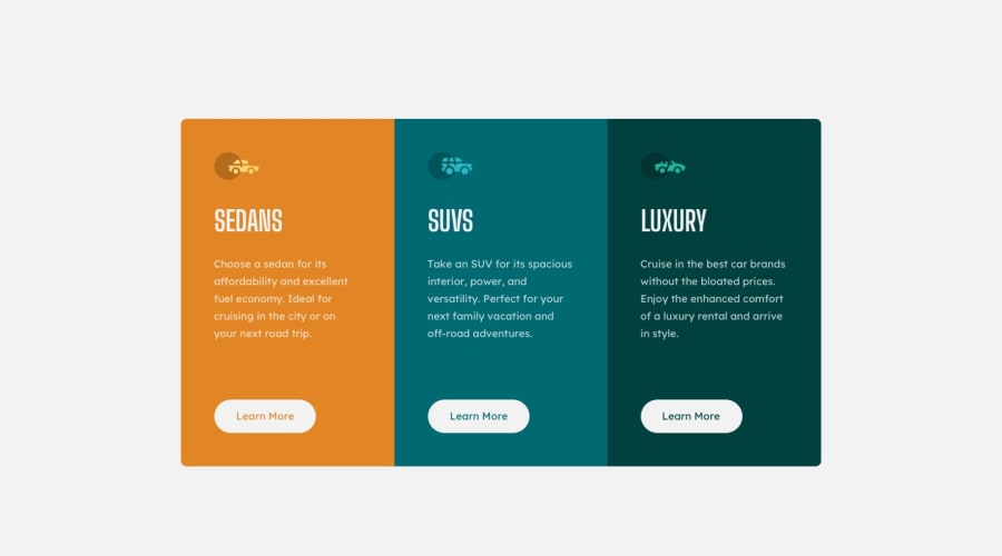
Design comparison
SolutionDesign
Community feedback
- @MadmandenPosted almost 3 years ago
Hi Raga, the mobile version looks great. I think you might have switched the button text color on the two last cards though (SUV and luxury) 😊
0@RagaBoGaaPosted almost 3 years ago@Madmanden hello sir! well yeah you are right I didn't even notice :D thanks for the feedback!
0
Please log in to post a comment
Log in with GitHubJoin our Discord community
Join thousands of Frontend Mentor community members taking the challenges, sharing resources, helping each other, and chatting about all things front-end!
Join our Discord
