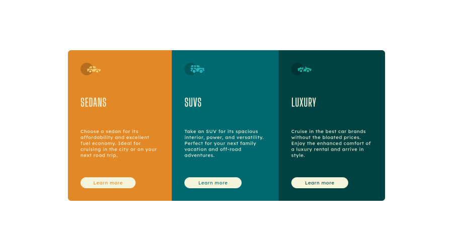
Design comparison
Solution retrospective
I would like to hear opinions about what I can improve in the code
Community feedback
- @pikapikamartPosted over 3 years ago
Hey, good work on this one. Layout seems fine and resizes well when going in mobile state.
A couple of suggestions would be that.
-
Not using
vhas your padding units. I see that you usedvhin your padding declarion in thebodytag. Now, when I open up dev tools from the bottom, your layout gets squished, because it is only occupying the remaining the viewport's height, since the dev tools already occupied them. I think it will be better if you used a fixed unit, or something that does not scale relative to the viewport likerememorpx. This way, it will make sure that your components won't be destroyed. -
Using
ptag in the learn more. I think usingatag is a better way since that learn more is supposed to be a link of some sort right or usingbutttonif that were to be a modal pop up. Soptag is I think not the right choice.
But still, you did a good okay in here, layout is good just those mentioned above, okay^^
1@VILLALBA-22Posted over 3 years ago@pikamart Thanks! these suggestions help me too much to improve!
0 -
Please log in to post a comment
Log in with GitHubJoin our Discord community
Join thousands of Frontend Mentor community members taking the challenges, sharing resources, helping each other, and chatting about all things front-end!
Join our Discord
