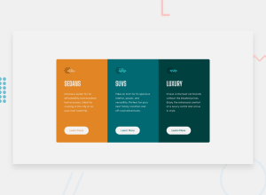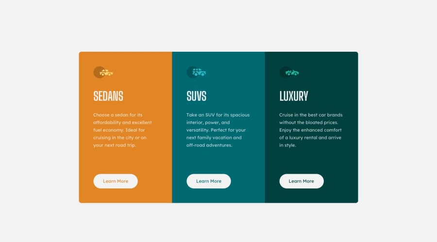
Design comparison
Community feedback
- @correlucasPosted about 2 years ago
👾Hi Uzair, congrats on completing this challenge!
I saw your solution preview site and I think it's already really good. Here’s some tips for you to improve it:
1.You’ve used
pxas the unit for sizes but the problem with pixels is that its not optimized for multiple devices and screens. So a good fit its to useremoremthat have a better performance and make your site more accessible between different screen sizes and devices.REMandEMdoes not just apply to font size, but to all sizes as well.2.To make your CSS code easier to work you can create a
single classto manage the content that is mostly the same for the 3 cards (paddings, colors, margins and etc) and another class to manage the characteristics that are different (colors and icon), this way you'll have more control over then and if you need to change something you modify only one class.✌️ I hope this helps you and happy coding!
Marked as helpful1@uzairK134Posted about 2 years ago@correlucas I was wondering how many ways I could have made my code more efficient so I put all the similar properties under the same h1, p, button tags but yes I do feel using the same class for each would be better as you mentioned.
0 - @IDev11Posted about 2 years ago
Hey @uzairK134 , how are you doing?
I saw the preview of the site, and you did a great job on this challenge, but I have a few tips that I think you'll like.
1- Document should have one main landmark, you could have put all the content inside the main tag.
2- you can check the report above, it will help you.
The rest is great!! Hope it helps.
0
Please log in to post a comment
Log in with GitHubJoin our Discord community
Join thousands of Frontend Mentor community members taking the challenges, sharing resources, helping each other, and chatting about all things front-end!
Join our Discord
