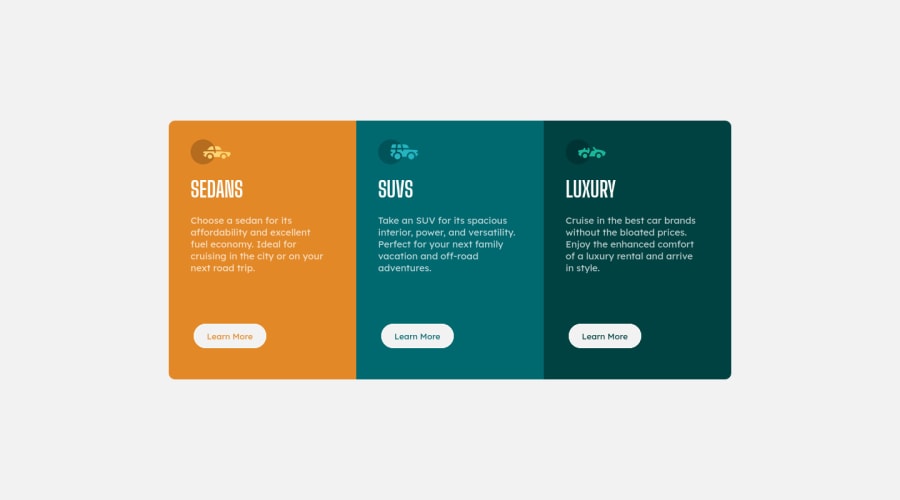
Design comparison
SolutionDesign
Solution retrospective
Whats the best practice to make a mobile version ?
Please log in to post a comment
Log in with GitHubCommunity feedback
- @iagohenrique2009
hi @rubah86 the best way of making the design for mobile are using @media (max-width: 500px)
and using the following properties
.container{ display:flex; flex-direction:column; }
and
body{ padding:2rem; }
if this dont works you could see how i made my design in my solution:
https://github.com/iagohenrique2009/FrontendMentorChallenges/blob/main/3-column-preview-card-main/media.css;
Join our Discord community
Join thousands of Frontend Mentor community members taking the challenges, sharing resources, helping each other, and chatting about all things front-end!
Join our Discord
