Design comparison
SolutionDesign
Solution retrospective
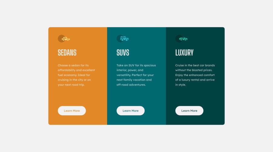
I did the unique styling on the cards using nth-child selectors. To me this seemed the most efficient way and to account for further cards being added to the main component. What do you guys think, is there a better way to do this?
Thanks.
Community feedback
Please log in to post a comment
Log in with GitHubJoin our Discord community
Join thousands of Frontend Mentor community members taking the challenges, sharing resources, helping each other, and chatting about all things front-end!
Join our Discord
